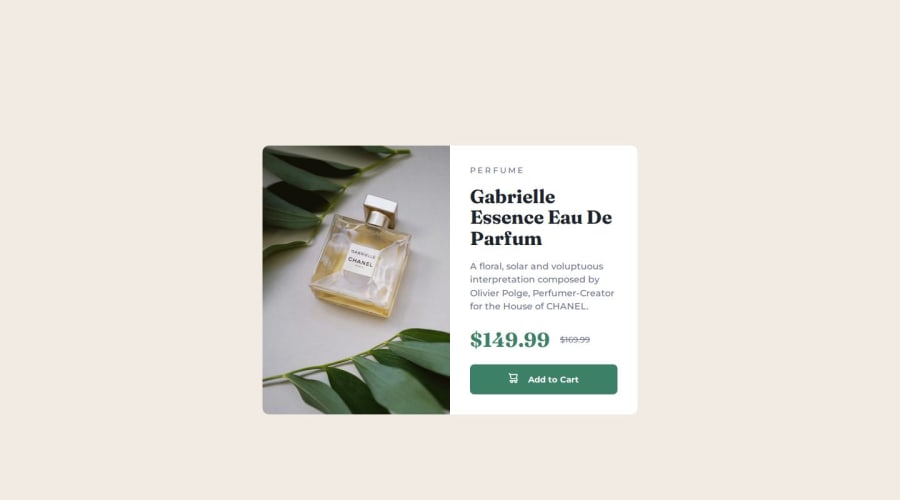


Design comparison
SolutionDesign

Solution retrospective
What challenges did you encounter, and how did you overcome them?
It was quite a challenge to figure out how to make card responsive both mobile and desktop. In the end, grid was the best option.
Community feedback
- @MikDra1Posted 3 months ago
Here are some tips from me to make your life easier.
- Never set fixed height. Instead set a min-height.
- There is an easy way of making card responsive and here is how you can do this, :
.card {
width: 90%;
margin: 0 auto;
max-width: 600px;
It will prevent card from growing bigger then 600px but on smaller screens it will be 90% of the viewport.
Here is also my way of centering the card:
.container {
display: grid;
place-items: center;
min-height: 100vh;
}
Hope you found this comment helpful 💗
Good job and keep going 😁😊😉
0

Please log in to post a comment
Log in with GitHub
Join our Discord community
Join thousands of Frontend Mentor community members taking the challenges, sharing resources, helping each other, and chatting about all things front-end!
Join our Discord