

Design comparison

Solution retrospective
Still need to figure out how to size images and content in the correct way. I had troubles giving the description the same size of the image in a consistent way. I didn't want to use pxs but I had to do it eventually. Any help or suggestions will be appreciated!
Community feedback
- @tarekulPosted 4 months ago
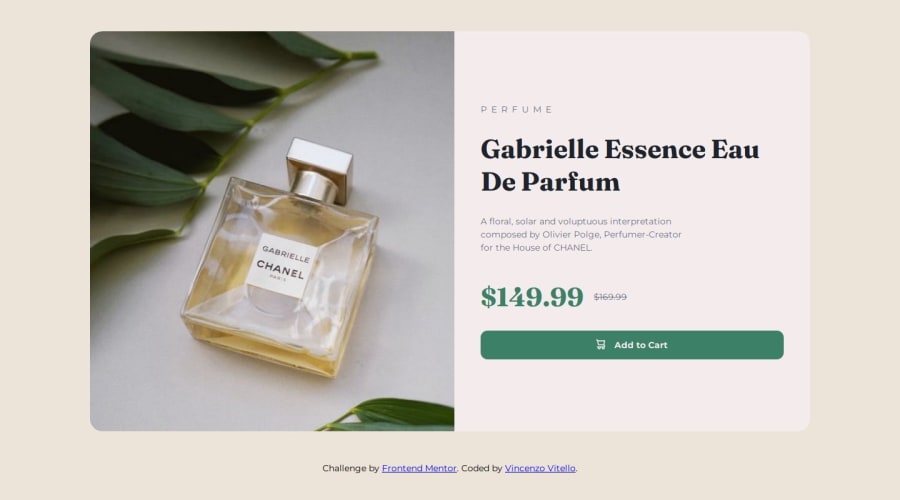
Overall great job. Looks Great. Here are some design comments: The background color of the card component in desktop version does not match the color in the mobile version. Also the mobile version background outside of the color is white when it should be a neutral cream color as specified in the design. The button to add product to cart does not behave as button. It doesn't apply any affects when I click on the button. You can change mouse to pointer when user hovers over the button.
For responsive text you can use em or rem instead of px. Em is relative to the font-size of the parent element. Rem is relative to the root element(html). If font-size of root element is 16px than 2rem = 16 * 2 = 32px. This way your font is flexible and scales.
Marked as helpful0@vincenzo-vitelloPosted 4 months ago@tarekul thank you very much for your help and support, I'm about to redo the project and I'll try to follow your instructions to see if I can do better. Appreciate it a lot 🙏
1

Please log in to post a comment
Log in with GitHub
Join our Discord community
Join thousands of Frontend Mentor community members taking the challenges, sharing resources, helping each other, and chatting about all things front-end!
Join our Discord