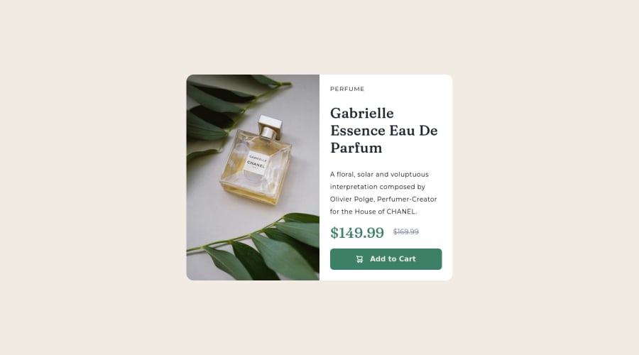
Product Preview Card with flexbox and screenreader-only text
Design comparison
Solution retrospective
The worst thing I did when working on this challenge was forgetting to add screenreader-only text. I only realised how stupid I am when I watched Kevin Powell do this challenge!
Also, the solution for responsive images that I found in the MDN reference... didn't work no matter how hard I tried.
I guess my solution is not the most elegant one overall (the CSS code needs a lot more structure and some comments I think), but I'll submit this one and probably redo this challenge when I'm more experienced --- and then I'll compare the solutions and see how much I've grown. Hopefully.
Community feedback
Please log in to post a comment
Log in with GitHubJoin our Discord community
Join thousands of Frontend Mentor community members taking the challenges, sharing resources, helping each other, and chatting about all things front-end!
Join our Discord
