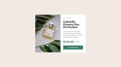
Submitted about 1 year agoA solution to the Product preview card component challenge
Product preview card with flexbox and grid
P
@shruticodes01

Solution retrospective
What are you most proud of, and what would you do differently next time?
- Using CSS Grid and Flexbox
- Learning that button should can have a display of inline-flex instead of flex.
- Using min-width to adjust image-size.
- Using BEM naming method
- Practicing to keep the code robust and readable.
Card image - width of 50% on card image and the class of card_details, ended up scaling the image down.
But applying min-width on the image adjusted the image to 50% of the card width and 100% of the height.
What specific areas of your project would you like help with?All kinds of feedback and different approaches to the solution would be helpful. Thank you.
Code
Loading...
Please log in to post a comment
Log in with GitHubCommunity feedback
No feedback yet. Be the first to give feedback on shruticodes01's solution.
Join our Discord community
Join thousands of Frontend Mentor community members taking the challenges, sharing resources, helping each other, and chatting about all things front-end!
Join our Discord