

Design comparison

Community feedback
- P@jeffgrahamcodesPosted 2 months ago
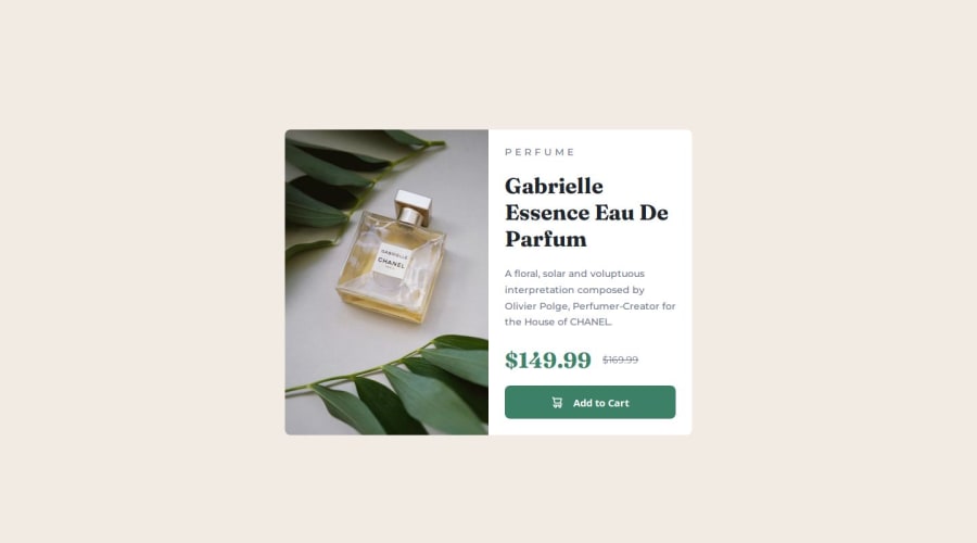
This solution demonstrates strong alignment with the design, with a clean and structured layout that adapts well across mobile and desktop screen sizes. The use of semantic HTML elements such as <article>, <picture>, and appropriate headings helps ensure content is well-organized and accessible. The CSS is well-structured, with effective use of flexbox for layout management and design tokens (e.g., variables for colors and typography) to improve maintainability. However, adding meaningful alt text to the product image would improve accessibility by providing context for screen readers. Additionally, the button could benefit from more defined focus and hover states to enhance interactivity for users navigating via keyboard or touch.
The code could be further refined by grouping shared styles and adding more comments to clarify specific sections of the CSS. Overall, this is a well-executed solution that matches the design closely, with opportunities for small adjustments to enhance accessibility, interactivity, and scalability. Great work! 🚀
Marked as helpful0

Please log in to post a comment
Log in with GitHubJoin our Discord community
Join thousands of Frontend Mentor community members taking the challenges, sharing resources, helping each other, and chatting about all things front-end!
Join our Discord