Design comparison
SolutionDesign
Community feedback
- P@acandaelPosted 9 months ago
Nice job, I see you also did a mobile-first design.
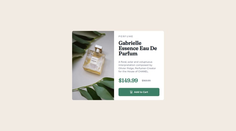
my only remark is the alt tag of your product image. You shouldn't mention it's an image. The screenreader technology knows it's an image. Just describe what the image is showing.
1
Please log in to post a comment
Log in with GitHubJoin our Discord community
Join thousands of Frontend Mentor community members taking the challenges, sharing resources, helping each other, and chatting about all things front-end!
Join our Discord
