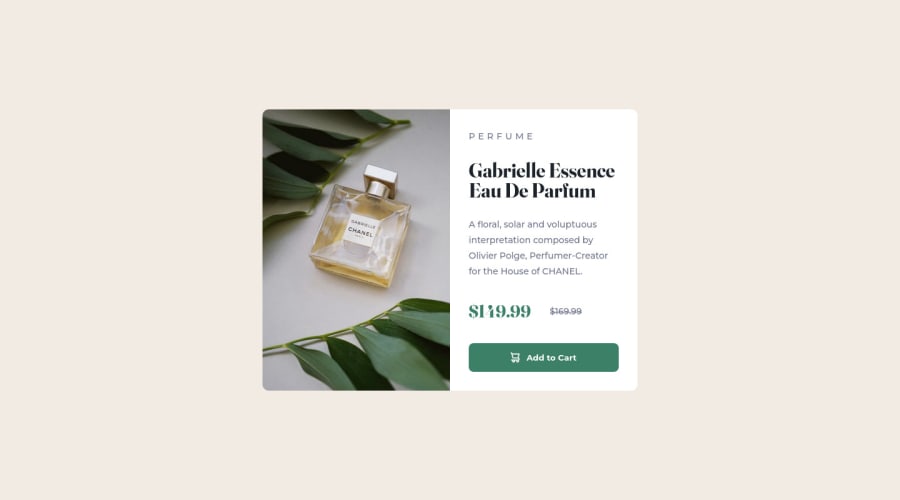
Design comparison
Solution retrospective
Third Frontend Mentor Project. #Flexbox
Community feedback
- @Hussain760Posted about 2 years ago
Hello PVI! Great work here...
Viewing your work from the Website, I noticed the image (ie. class="card_picture" in your code) is a bit shifted to the top and it distorts your design.
You can fix this by placing image in html instead of background-image and placing @media at 630px instead of 375px
Again, you've done great work.
Marked as helpful1@PVIdubsPosted about 2 years ago@Hussain5325. Thank you very much for the support and the comment... It helps me a lot... I preferred that solution at the time because I felt more comfortable using background-image, but your solution is much better than mine... I'll improve that detail... Once again, thank you very much...
0
Please log in to post a comment
Log in with GitHubJoin our Discord community
Join thousands of Frontend Mentor community members taking the challenges, sharing resources, helping each other, and chatting about all things front-end!
Join our Discord
