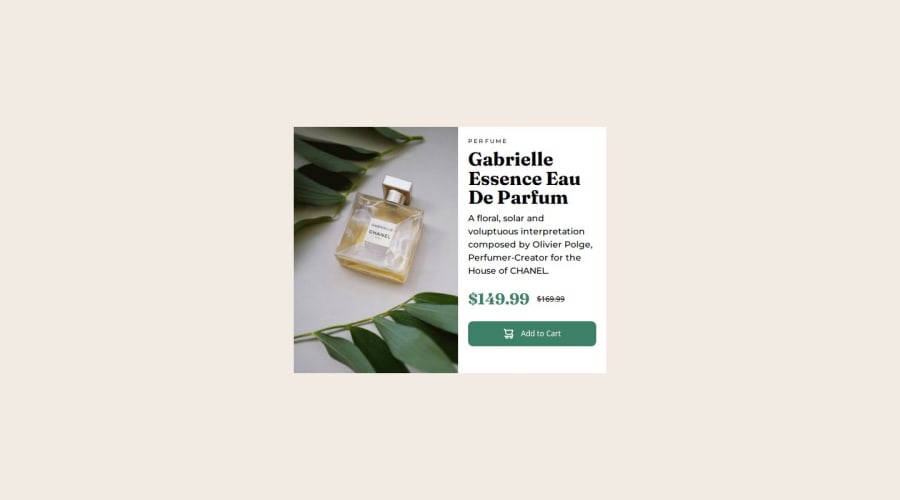
Product-preview-card using tailwindcss and flexbox


Design comparison

Solution retrospective
I am proud of starting to understand responsive design, next time I will try to understand more and more each step during the coding process.
What challenges did you encounter, and how did you overcome them?When I resized the window to check the change in the layout from mobile to desktop, I saw no changes. Then, I realized that it was not necessary to write exactly 375px in the tailwind.config.js file. I could simply write a greater number, so finally it worked.
What specific areas of your project would you like help with?I would like to know if there is another way in Vercel to select the folders, because I use to move the images from the images folder to the src folder, otherwise Vercel cannot read the images. I don't know if what I do is really necessary or there is a better way to do it.
Community feedback
Please log in to post a comment
Log in with GitHub
Join our Discord community
Join thousands of Frontend Mentor community members taking the challenges, sharing resources, helping each other, and chatting about all things front-end!
Join our Discord