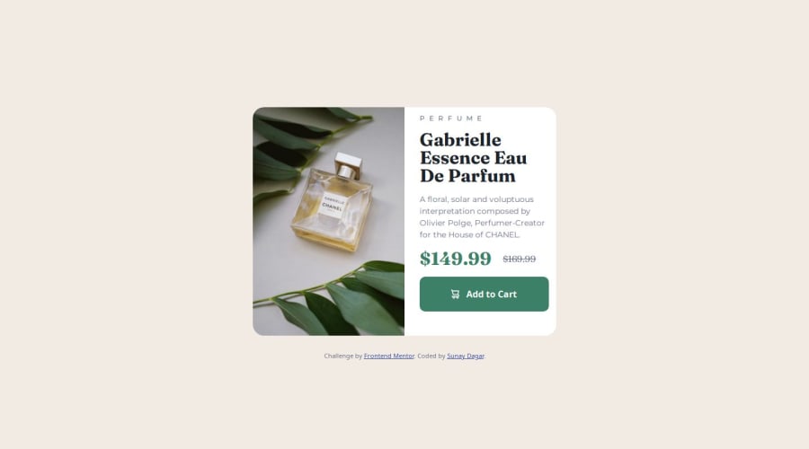
Product Preview Card using Semantic HTML 5, SCSS + CSS Grid & Flexbox


Design comparison

Solution retrospective
- First time using SASS/SCSS after learning from an online tutorial. I learnt how to implement the SASS file structure, variables, nesting, functions and mixins.
- First time using BEM methodology which turned out to be quite helpful and i quite like it.
- First time trying out a mobile first approach which helped me understand the strengths and weaknesses of such a workflow.
- Researching online helped me solve a lot of responsiveness issues i was facing, all hail stack overflow 💯. -Further improved my understanding of my base CSS knowledge especially CSS Grid & Flexbox.
- In short a lot of first time experiences 🥳.
- Initially struggled with figuring out the SCSS file structure that would be most suitable, i.e;
- What should go in my
main.scss, how many scss files do i need and for what purpose, and after some research i was able to find the base layout of what is usually done then went ahead from there. - Nesting was very confusing at first but quickly learnt what i was doing wrong and how i could leverage BEM to target exactly what i wanted.
- What should go in my
- The preview looks good on small devices up to medium laptop screens but on large screens in my opinion the product card looks too zoomed in. I followed a mobile first approach and i guess that's where the issue is? I'm not sure, but I would've like the product card to look a bit smaller and centered on larger screens so that it looks a bit more aesthetically pleasing to the eyes. So if anyone has any tips on what i could do differently next time please feel free to share. -Also, since this is my first -time using SCSS, any tips/tricks would be much appreciated for example on how to optimize code / file structure, etc.
-Thank you in advance 🙂.
Community feedback
- @py-code314Posted 7 months ago
Hello, congrats on finishing your project. I've just finished this project and I also used Sass for first time to do it. So, cheers to that 👏🏼
As I went through your code, I thought I could make some suggestions
HTML:
- You should use <picture> element to switch the images depending on mobile and desktop views instead of wrapping them in <div>. Please refer to this article on how to do that
- For 'Perfume' it's best to use <p> tag as it's better to avoid <h2> before <h1> for accessibility purposes. Also it's recommended to change it to uppercase by using CSS, not in HTML itself
- For strikethrough old price, please use either <s> or <del> tag as it is more semantic
- Your BEM nomenclature of classes looks good 👍🏼
- Finally, I suggest this article by Grace Snow if you want to improve your HTML
CSS:
- In your '_config' file you can also add variables for font-size and spacing if you want
- Use 'rem' or 'em' for @media instead of px for better responsiveness
- You already have
border-radiuson.product-card, so I don't think you need it on 'mobile image' too - You don't need 'visibility' and 'position' properties for images if you use <picture> element and grid properties
.product-card max-widthis not 1000px in desktop view (I think that's why card is bigger than in the design file), it's only 600px (use rem here for better responsiveness) and in mobile viewmax-widthis 343px- I don't think font-size for 'content' is increasing from mobile to desktop. Can you please double check that!
- I believe new syntax to import partials is @use
- I suggest adding
btn: focusandbtn: activestatuses to your code - To center #main
body {
  display: flex;
  justify-content: center;
  align-items: center;
}
Hopefully these suggestions make your project better. Please contact me if you have any further questions. All the best. Happy coding 🎉
Marked as helpful1@suzzy-dszyPosted 7 months ago@py-code314 Thank you so much for the advice, I'll be sure to try out all that you've suggested, and read up on the article on responsive web design to further aid my understanding. If you don't mind, i shall also take a look at your solution after i attempt the fixes to help gain an insight into what I've done right/wrong, otherwise If any issues do arise I'll be sure to contact you. Once again, thank you so much and props to you too for using SASS for the first time 😄🎉💯
1@suzzy-dszyPosted 7 months ago@py-code314 Hello once again, I finally managed to achieve what was required all thanks to the advice you provided. I just wanted to say thank you, your advice helped me to better understand where I went wrong and what steps were needed to correct them. 😄💯
1

Please log in to post a comment
Log in with GitHub
Join our Discord community
Join thousands of Frontend Mentor community members taking the challenges, sharing resources, helping each other, and chatting about all things front-end!
Join our Discord