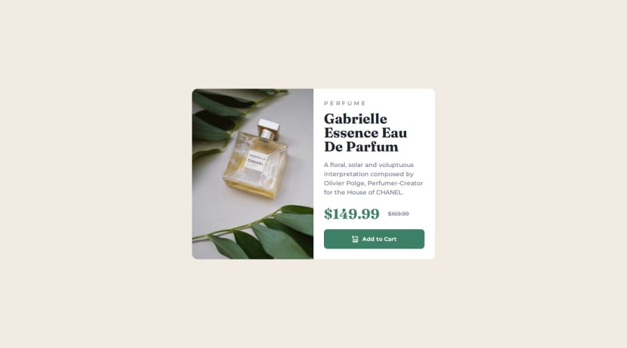
Product preview card using React, SASS, Media Queries, and Flex


Design comparison

Solution retrospective
I’m proud of handling more complex elements and improving daily. I’ve learned to use a mobile-first approach and SCSS for responsive design. Next time, I’d focus on optimizing performance and exploring advanced techniques.
What challenges did you encounter, and how did you overcome them?I struggled with responsive design but overcame it by learning a mobile-first approach and using SCSS to adapt images to different screen sizes.
Community feedback
- P@chelsea-herePosted 9 months ago
I love how clean your code is! It gave me a few ideas. It looks like the design didn't quite translate between mobile and desktop - this is apparent in the snapshot as I'm sure you noticed. If you look at the figma file, you'll find the container size and gap differences for the card laid out. The container is quite a bit larger than what you have shown and spacing should adjust accordingly. Cheers!
Marked as helpful0@rainofPosted 9 months ago@chelsea-here Thank you for the kind words! I appreciate your insights on the design differences between mobile and desktop. It's always valuable to get another perspective on these details. I'll recheck the Figma files and learn from them :)
0

Please log in to post a comment
Log in with GitHub
Join our Discord community
Join thousands of Frontend Mentor community members taking the challenges, sharing resources, helping each other, and chatting about all things front-end!
Join our Discord