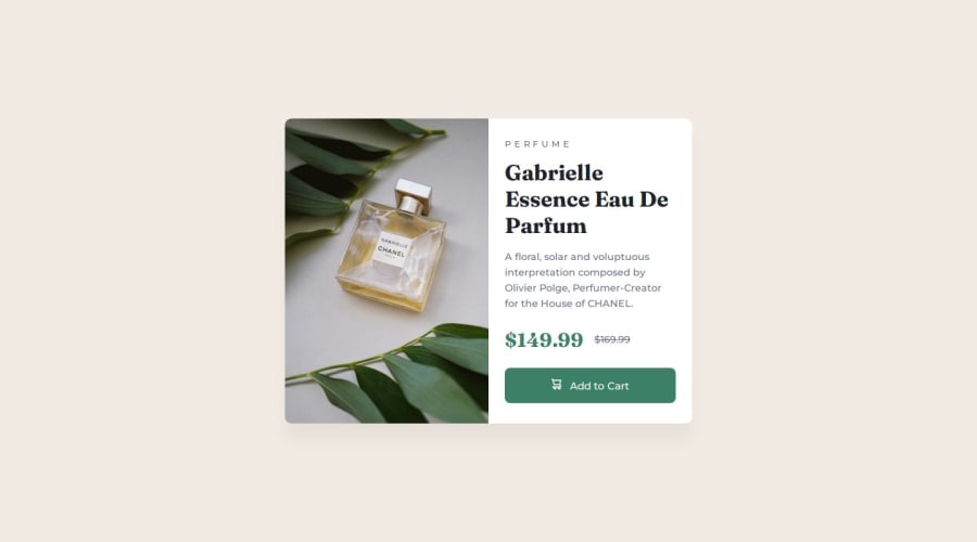
Design comparison
SolutionDesign
Solution retrospective
What are you most proud of, and what would you do differently next time?
I am proud that I didn't need to change a lot of things when using the media query, as I just need to change the flex-direction and the max-width of the image. I definitely will try obtain the same behavior but using flex-wrap and the clamp for my font-sizes.
I find challenging placing the image with the right size when the image are inside a picture. I've overcome that after a long time by changing the display of the picture to contents.
I'll appreciate any feedbacks to improve my solution :)
Please log in to post a comment
Log in with GitHubCommunity feedback
No feedback yet. Be the first to give feedback on David Dutra's solution.
Join our Discord community
Join thousands of Frontend Mentor community members taking the challenges, sharing resources, helping each other, and chatting about all things front-end!
Join our Discord
