Design comparison
Solution retrospective
I need help to make this design responsive
Community feedback
- @ItsZubekPosted 6 months ago
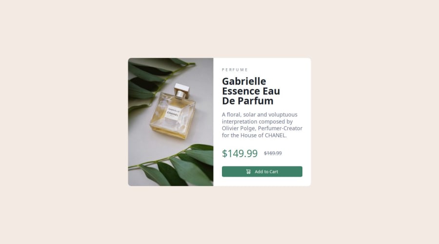
The solution looks alright, however I see that the image is slightly smaller in width than the right side of the product card. You can fix it by assigning
flex-basisproperty a value of50%to both the image and the right side of the card. This way they will always take 50% of available space and basically, will be equal in size.As for the responsiveness of the design I see that you included
mediaquerries in your code, but it would be more effective if you set them a bit higher, i.e.600pxinstead of 400 something. I understand this is a rather small thing, but can still make your design look better.I see that you've used
imginstead of thepicturethat was discussed in the article before this challenge. This forces you to usedisplay: nonewhen changing the screen size to mobile from desktop and vice versa. Checkpictureonline as it will make next mobile responsive designs a lot easier for you and you will avoid unnecessary code.Also
alttags are important for accessibility. I understand this is just a challenge on a frontend website, but it's good practice to not forget them even when working on fake projects as it will create a possibly harming habit in the future.Overall the design and code look good, but some small tweaks can be made to make it more readable adn resemble the design a little more.
Marked as helpful1@hazhir00Posted 6 months ago@ItsZubek Hi Zubek, I am very grateful and pleased to receive such great feedback. I learned a lot from it, and I will do my best to implement it in future projects. Thank you very much ❤
1
Please log in to post a comment
Log in with GitHubJoin our Discord community
Join thousands of Frontend Mentor community members taking the challenges, sharing resources, helping each other, and chatting about all things front-end!
Join our Discord
