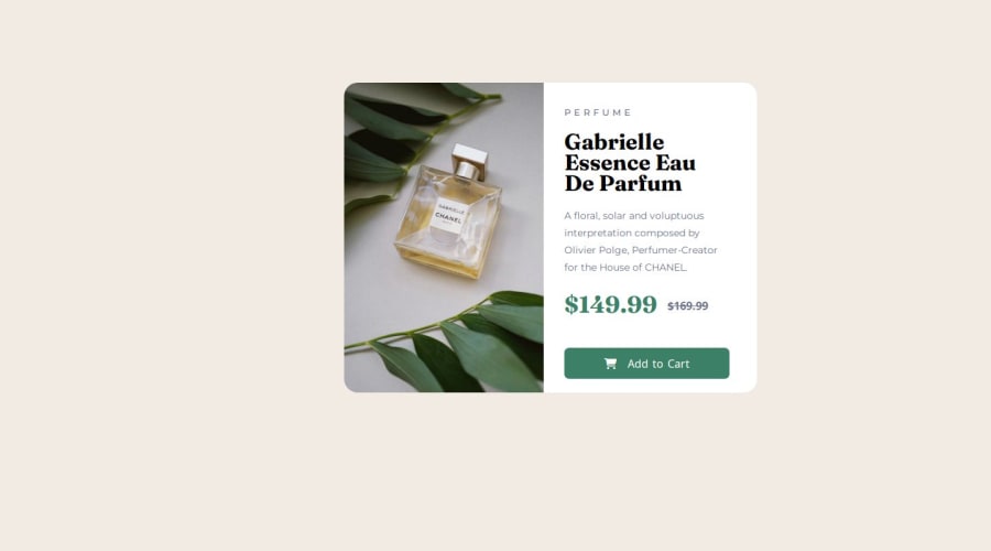
Design comparison
SolutionDesign
Solution retrospective
What are you most proud of, and what would you do differently next time?
i will effecient code with minimal line
What challenges did you encounter, and how did you overcome them?nothing
What specific areas of your project would you like help with?check i am doing good or i need to change
Community feedback
- @Grimm-NPosted 5 months ago
@balaji282004, I really appreciate the effort you put into this! Your design is coming along nicely. I have a few suggestions that could help enhance it further:
-
Centering the Card with Flexbox:
- To center the card within the body, consider using Flexbox. You can add the following styles to the
body:body { display: flex; justify-content: center; /* Centers the card horizontally */ align-items: center; /* Centers the card vertically */ height: 100vh; /* Ensures body takes full height of the viewport */ }
- To center the card within the body, consider using Flexbox. You can add the following styles to the
-
Use of Responsive Units (em, rem, %, vh, vw):
- I recommend using
em,rem,%,vh, andvwfor sizing and spacing instead of fixed units like pixels. These units are more responsive and allow for better scalability, making your layout adaptable to different screen sizes and user preferences.
- I recommend using
-
Creating the Card with Flexbox or Grid:
- It would be great to try creating the card layout using Flexbox or CSS Grid instead of positioning. This approach provides more flexibility in managing layout changes, improves responsiveness, and avoids potential overlapping issues that can occur with absolute positioning.
Wishing you continued success in your future coding endeavors! Keep up the great work!
Marked as helpful2 -
Please log in to post a comment
Log in with GitHubJoin our Discord community
Join thousands of Frontend Mentor community members taking the challenges, sharing resources, helping each other, and chatting about all things front-end!
Join our Discord
