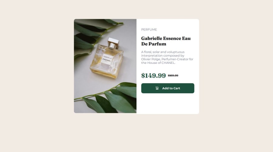


Design comparison

Solution retrospective
I would like to get a detailed explanation on the best layout to use for this particular project. Also how to make the image and the side explanation box to be of the same height for other screen sizes that are not mobile.
Community feedback
- @AdrianoEscarabotePosted 5 months ago
Hey Michael-Alans, how’s it going? I was really impressed with your project’s result, though I have some advice that could be helpful:
Using Flexbox or Grid on the
bodyto center elements ensures a more responsive and adaptive layout, fitting different screen sizes seamlessly. It avoids manual calculations and constant adjustments needed withmargin,padding, or absolute positioning. These techniques provide more consistent alignment and simplify the code.flexbox:
body {
    display: flex;
    justify-content: center;
    align-items:  center;
    min-height: 100vh;
}
grid:
body {
    display: grid;
    place-content: center;
    min-height: 100vh;
}
Everything else looks great.
Hope this helps! 👍
0@Michael-AlansPosted 5 months agoThank you so much for the corrections @AdrianoEscarabo . I will put it into practice. Thanks.
0@Michael-AlansPosted 5 months agoThank you so much for the corrections @AdrianoEscarabo . I will put it into practice. Thanks.
1


Please log in to post a comment
Log in with GitHub
Join our Discord community
Join thousands of Frontend Mentor community members taking the challenges, sharing resources, helping each other, and chatting about all things front-end!
Join our Discord