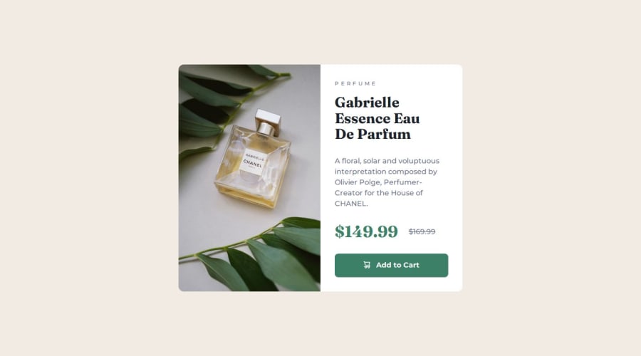
Design comparison
Solution retrospective
Being able to apply min-width to the card container so that it doesn't decrease by size every time i resize the view-port.
What challenges did you encounter, and how did you overcome them?Applying responsive layouts without the designing breaking every 100px-200px. I used min-width to solve that.
What specific areas of your project would you like help with?Being able to write standardized media queries and what common styles am I supposed to focus on when using media queries.
Community feedback
- @Alex-Archer-IPosted 8 months ago
Hi!
I'm really don't want to discourage you and
min-widthis interesting finding for your design approach, but that is an opposite to main idea of responsive design. It's good when your card decreased with the screen width - that's how it adjust to smaller screens without having multiple media queries. And than you usemax-widthto prevent it for stretch on the big screens.Also I can recommend you a
picturetag to dynamically switch images on the different versions of the screens. It looks like this:<picture> <source srcset="mobile.jpg" media="(max-width: 900px)"> <img src="desktop.jpg" alt=""> </picture>This tag has one or multiple
sourcetags withmediacondition andimgtag which will be rendered if no one of the conditions is valid.So, you work is really good and you are used correctly semantic tags. Keep doing =)
Marked as helpful0 - @Leo-yagamiPosted 8 months ago
@Alex-Archer-I See, the problem I mainly faced was that when I didn't use min-width, my design would break very frequently. This required me to make twice as many media queries as I used now. If I am understanding correctly instead of making my container width not move using min-width as a resize down, I should use max-width to make my design stop expanding at a certain width to preserve the design.
0@Alex-Archer-IPosted 8 months ago@Leo-yagami
Yes, the main idea of responsive design is to match as much mobiles screen as possible. So it's a good idea to allow it adjust to various small screens.
Also, what do you mean by breaking design? If you mean lines alignment than it's normal if they would look slightly different on the different screens.
0@Leo-yagamiPosted 8 months agoThanks for the tip, I will try using max-width next time. And by the way, do you recommend doing mobile-first or desktop-first?
1@Alex-Archer-IPosted 8 months ago@Leo-yagami
Well, I find out for myself that mobile-first are more convenient if you need to create mobile layout (which you'll need in 95% =)), but it was a bit hard at first to change my mindset =)
0@Leo-yagamiPosted 8 months ago@Alex-Archer-I Well I will try and adopt that mindset, thanks a bunch
1@Alex-Archer-IPosted 8 months ago@Leo-yagami
You're welcome. Feel free to ask anything, comment and stuff =)
1
Please log in to post a comment
Log in with GitHubJoin our Discord community
Join thousands of Frontend Mentor community members taking the challenges, sharing resources, helping each other, and chatting about all things front-end!
Join our Discord
