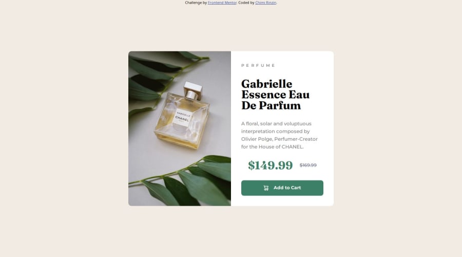
Design comparison
Solution retrospective
I was able to build and design the page now, with much less confusion and more experience in my hand.
What challenges did you encounter, and how did you overcome them?The challenges came after the completion of the practice. When I deployed this using Github, from where I went to the live site, everything seemed wrong. My images were not loading and it seemed that there was no CSS made for it to begin with.
Community feedback
- @asyirriPosted 7 months ago
Good Job for completing the challange.
First, your HTML structure is great with proper semantic element. Second, Your CSS is good, you have used root to declare frequently repeated variables and used reset CSS to generalize the style in the browser before using it in your project.
A little advice from a newbie in the front-end field, I think the media query section can still be shortened further because basically only small part of it is changed, not too much
I hope it helps. Thanks and Regards.
1@ChimiRinzin-HWRPosted 7 months ago@asyirri Thank you very much, the advice is appreciated.
0
Please log in to post a comment
Log in with GitHubJoin our Discord community
Join thousands of Frontend Mentor community members taking the challenges, sharing resources, helping each other, and chatting about all things front-end!
Join our Discord
