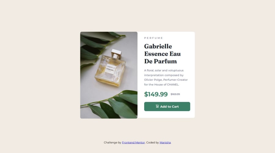
Design comparison
Solution retrospective
Maybe try to use less code.
What challenges did you encounter, and how did you overcome them?I didn't encounter any special challenges just the small one adjusting all in one container.I used grid for it and solved.
Community feedback
- @marliedevPosted 6 months ago
First Look on Desktop looks fine. But when inspecting in Detail there are some inconstistencies.
- The image extends slightly beyond the edge of the card and has rounded edges on the right side
- The font-family for price is not correct.
When changing to mobile view there are even more "problem".
- The Image swaps to early.
- The title (h1) is much to big for mobile devices
- At some point (at around 470px) the button moves outside the box.
Improvements:
- check your result in detail and test it extensively! This is a crucial skill!
- flexbox is best for this kind of layout. At least for the mobile design.
- have a look at grid in detail. The use of grid-template-rows with percentage values is the reason why your mobile layout is "shot"
- use lower case names in css and html and usekebab-case style
Marked as helpful0@Manisha3196Posted 6 months agoHi, Thank you for the feedback.Its really helpful to me.I made some changes to the code based on your suggestions.If you get any free time,please check it out.@marliedev
0@marliedevPosted 6 months agoHi! Well done! That looks, behaves and feels much better :)
0
Please log in to post a comment
Log in with GitHubJoin our Discord community
Join thousands of Frontend Mentor community members taking the challenges, sharing resources, helping each other, and chatting about all things front-end!
Join our Discord
