Not Found
Not Found
Not Found
Not Found
Not Found
Not Found
Not Found
Not Found
Not Found
Not Found
Not Found
Not Found
Not Found
Not Found
Not Found
Not Found
Not Found
Not Found
Not Found
Not Found

Submitted

Product Preview card using HTML and CSS

@a-almeida10

Desktop design screenshot for the Product preview card component coding challenge

This is a solution for...

  • HTML
  • CSS
1newbie
View challenge

Design comparison


SolutionDesign

Solution retrospective


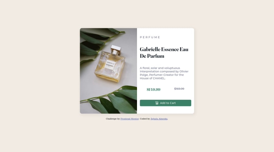
The most challenging part for me was working with the responsivity in different screen sizes while keeping the image in the correct position.

Community feedback

Lucas 👾 104,420

@correlucas

Posted

👾Fala Ághata , tudo bem? Parabéns pelo seu primeiro desafio e seja bem vinda a comunidade do Frontend Mentor!

Primeira solução e vc ja entrega um ótimo desafio, mandou bem! Aqui algumas dicas pra vc:

O valor da sombra do componente está um pouco forte, você pode melhorar isso colocando menos opacity e mais blur, aqui um valor bom pra essa sombra: box-shadow: 5px 5px 15px 5px rgb(0 0 0 / 5%);

Esse desafio é uma ótima oportunidade pra usar grid, se vc quiser tentar aqui está o passo a passo:

Defina seu width como max-width: 900px (é o tamanho do contêiner) e display: grid / grid-template-column: 1fr 1fr (isso significa que seu componente terá duas colunas com 50% da largura do contêiner cada uma é ** 50px**)

👋 Espero ter ajudado e continue no foco!

Marked as helpful

1

@a-almeida10

Posted

@correlucas Olá, Lucas! Muito obrigada pelo feedback e pelo incentivo! A sombra ficou muito mais suave com o valor que você sugeriu. :D

1
Elaine 11,400

@elaineleung

Posted

Hi Ághata, welcome to Frontend Mentor, and congratulations on completing your first challenge! 😊

I know what you mean about the responsiveness in this challenge, as I also see many people struggling with keeping things at an optimal size when the layout shifts. Here are some suggestions I have based on what I'm seeing in your code:

  1. Right now I can only see a desktop image and not the mobile one. To put both images within the HTML, you can try using the img tag like this, where srcset contains your images and the width of the image in w, and sizes would specify the breakpoint you use as well as the preferred image, and src would be the initial image for the initial view you have:

    <img alt="perfume bottle" 
       srcset="images/image-product-desktop.jpg 600w, images/image-product-mobile.jpg 686w"        
       sizes="(max-width: 745px) 686px, 600px" 
       src="images/image-product-desktop.jpg">
    

    Be sure also to add object-fit: cover; on the img as well, otherwise it will be distorted!

  2. Right now when I resize the browser, the card would start to get really small; this is because of the viewport units you're using for the card (width: 33vw and height: 50vh) and the 100vh for the main container (this should be on the body selector instead of the container). What I would do is, I would remove all these as well as the height on the image. For the card container, I would add width: min(100%, 600px), which just tells the browser to choose the smaller value between these two values. Basically, this would make sure the card does not get past 600px in the desktop view. For the mobile view, you can also do the same thing with setting a limit (try width: min(100%, 450px)). I would also change the grid columns in the desktop view to grid-template-columns: 1fr 1fr so that the columns would be even, while for mobile view, I would remove the 100vh height if it's still there and also remove the grid-template-rows. At this point, you shouldn't need the overflow: hidden anymore.

  3. To make everything centered, I would add these lines to the body selector, and I would put the background color here instead of the main container:

    body {
       display: grid;
       place-content: center;
       min-height: 100vh;
       background-color: hsl(30, 38%, 92%);
    }
    

    Your body selector is the main canvas, and so you'd always want the background-color here as well as the min-height.

Here is my solution to this challenge in case you're interested: https://www.frontendmentor.io/solutions/card-component-using-cube-css-tNaBY0y_Nx. Hope some of these suggestions can help you with tackling responsiveness!

Marked as helpful

1

@a-almeida10

Posted

@elaineleung Hello! Thank you so much for your feedback! That was incredibly helpful, I spent a lot of time struggling with responsiveness and now I can see clearly where I was failing and it will be very useful for my following projects. :D

1
Adriano 34,090

@AdrianoEscarabote

Posted

Oi Ághata, tudo bem?

Bem-vinda ao Front-end Mentor. Gostei bastante do seu projeto. Tenho algumas dicas que penso que você ira gostar:

1- Document should have one main landmark, você poderia ter colocado todo o conteudo na tag main, deixaria o código melhor estruturado. clica aqui para ler sobre

2- Page should contain a level-one heading clica aqui

3- Images must have alternate text, para que as pessoas que usam app que auxiliam elas a navegar na web entenderem o que está na tela.

4- Vi que você colocou uma unidade de medida relativa para sustentar o card, mas o card está variando muito de tamanho e isso está quebrando um pouco layout, o meu conselho é que você poderia fazer esta mudança para uma unidade fixa para resoluções maiores, e com o auxílio do media query fazer a mudança para uma unidade relativa quando a resolução estiver do tamanho mobile.

O resto ficou ótimo. Espero que ajude... não esqueça de marcar como útil 👍

Marked as helpful

1

@a-almeida10

Posted

@AdrianoEscarabote Oi, Adriano, estou bem, e você? Muito obrigada pelo feedback! Os links foram super úteis, e eu havia mesmo esquecido do alt para as imagens.

0

@khaleed2002

Posted

that's a good design. I recommend you to use letter-spacing in the "Perfume" element it will be the same as the original design. keep going:)

Marked as helpful

1

@a-almeida10

Posted

@khaleed2002 Thank you for your feedback! I was wondering how to do that spacing :D

0

Please log in to post a comment

Log in with GitHub
Discord logo

Join our Discord community

Join thousands of Frontend Mentor community members taking the challenges, sharing resources, helping each other, and chatting about all things front-end!

Join our Discord