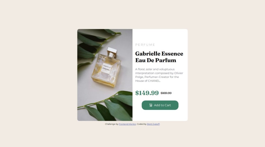
Design comparison
Solution retrospective
I never thought I'd be able to create this kind of site 2 weeks ago. So, I'm proud that I've stuck with it.
What challenges did you encounter, and how did you overcome them?I was struggling with the changing the image when it's max-width was at 375px. I ended up finding a solution that someone posted in the Discord and was able to figure out what he did.
What specific areas of your project would you like help with?When I was looking it up, I found that there is a and html but I couldn't actually figure out how that works. But I wonder if that was a solution.
I also could use some help on how to clean my code.
Community feedback
- @marliedevPosted 6 months ago
"The elements within HTML are inherently adaptive, yet by imposing fixed dimensions upon them, we confine their natural fluidity."
A sentence which comes in my mind, when i look at your solution :)
Basically: Good Work. The HTML on first sight looks good, but for sure also offers a lot of room for improvement.
First and most important tip: Don't work with fix sizes! Use relative values and limit the elements by using (if needed) maximum and minimum restriction. Therefore using a max-width or min-width is best. For example:
body {
    background-color: hsl(30, 38%, 92%);
    font-family: "Montserrat", sans-serif;
    // changed padding from a fixed value of 150px
    // to a relative value of 10% vertical-height
    // and a min of 1rem horizontally
    padding: 10vh 1rem;
}
div.card {
    background-color: #fff;
    display: flex;
    border-radius: 10px;
    width: 100% // instead of fixed 600px
    max-width: 600px; //added
    // height: 500px;  -> removed fixed height
    margin: auto;
}
div.content {
    // margin: auto; ->removed
    padding: 1rem; // adjusted padding to all sides
    // width: 280px; -> removed
}
div.cart {
    // margin: auto; -> removed
    display: flex;
    align-items: center;
    justify-content: center;
    border-radius: 20px;
    // width: 200px;  -> removed
    background-color: hsl(158, 36%, 37%);
    color: #fff;
}
// increased the width of breakpoint
@media screen and (max-width: 578px) {
    div.card {
        display: inline-block;
        // width: 340px;  -> removed
        // height: 525px;  -> removed
    }
    div.content {
        // width: 320px; -> removed
    }
}
And voila! You have a nice responsive card! You see: working with less properties sometimes ends in a better solution.
Keep practicing and have a look at flexbox too. It offers so much flexibility!
Marked as helpful2@BoffdubPosted 6 months ago@marliedev Thanks for this. I knew something was off.
I'm in the "Building Responsive Layouts" path right now, which means Flexbox is what I'm learning about next!
0 - @KapteynUniversePosted 6 months ago
Hey, nice job.
If you started 2 weeks ago, this might be overloading but :D...
Padding:150px;on the body is not efficient. Use flex or grid for centering. I prefer flexbody { display: flex; justify-content: center; align-items: center; min-height: 100vh; /* Since you have footer inside body, you gonna need this too */ flex-direction: column; }body { display: grid; place-content: center; min-height: 100vh; }To use different images on different screen sizes, you can use picture tag
<picture>
  <source media="(min-width:650px)" srcset="desktop img path">
  <img src="mobile img path" alt="meaningful alt text">
</picture>
If you need, you can have more than 1 source media too. Like at 500px use this img, 700 another, 1000 another etc.
Do not skip headings like from h1 to h3, and also don't use them for sizes, you can always style them. Check to the nesting section for better undertanting.
For future challenges using a modern css reset will make your life easier.
Using divs are ok but consider using semantic tags. For example instead of .div card you can use article tag and button for the add to cart.
Article; because this elements content can be changed and/or used somewhere else on the webpage. Button; because Add to Cart will be use to add this item to the cart for purchase.
Using landmarks and wrapping the content with main is a good practice. Every page needs one main. Like:
<body>
<header></header>  If needed
<main>
<div class="card">
...
</div>
</main>
<footer></footer> If needed
</body>
Avoid using hard coded values, like
width: 600px;, usemax-width: 600px;instead,max-width: 37.5rem;would be even better. Em/rem units are better for responsiveness. You can check Kevil Powells videos video-1 video-2Imgs need to have meaningful alt text, except for the decorative imgs. You already wrote something but i think it needs a little bit more context. Since english is not my mother tongue, I am very bad about it. So i can't give you an example for this one :D
1
Please log in to post a comment
Log in with GitHubJoin our Discord community
Join thousands of Frontend Mentor community members taking the challenges, sharing resources, helping each other, and chatting about all things front-end!
Join our Discord
