

Design comparison

Community feedback
- @correlucasPosted about 2 years ago
👾Hello @ghettobeast, Congratulations on completing this challenge!
Your solution its almost done and I’ve some tips to help you to improve it:
1.Add
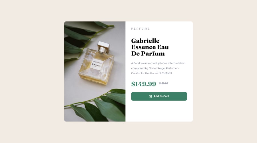
<main>instead of<div>to wrap the card container. This way you show that this is the main block of content and also replace the div with a semantic tag.2.You did a good work putting everything together in this challenge, something you can do to improve the image that needs to change between mobile and desktop is to use
<picture>instead of<img>wrapped in a div. You can manage both images inside the<picture>tag and use the html to code to set when the images should change setting the devicemax-widthdepending of the device (phone / computer) Here’s a guide about how to usepicture:https://www.w3schools.com/tags/tag_picture.aspSee the example below:
<picture>
  <source media="(max-width:650px)" srcset="./images/image-product-mobile.jpg">
  <img src="./images/image-product-desktop.jpg" alt="Gabrielle Parfum" style="width:auto;">
</picture>
✌️ I hope this helps you and happy coding!
Marked as helpful0 - @AnAvilableUsernamePosted about 2 years ago
to space elements, I would suggest using the row-gap method on the right side, also you may add a hover effect for the add to cart button,
btn-content:hover{ background-color: #1c3b30 ;}0


Please log in to post a comment
Log in with GitHub
Join our Discord community
Join thousands of Frontend Mentor community members taking the challenges, sharing resources, helping each other, and chatting about all things front-end!
Join our Discord