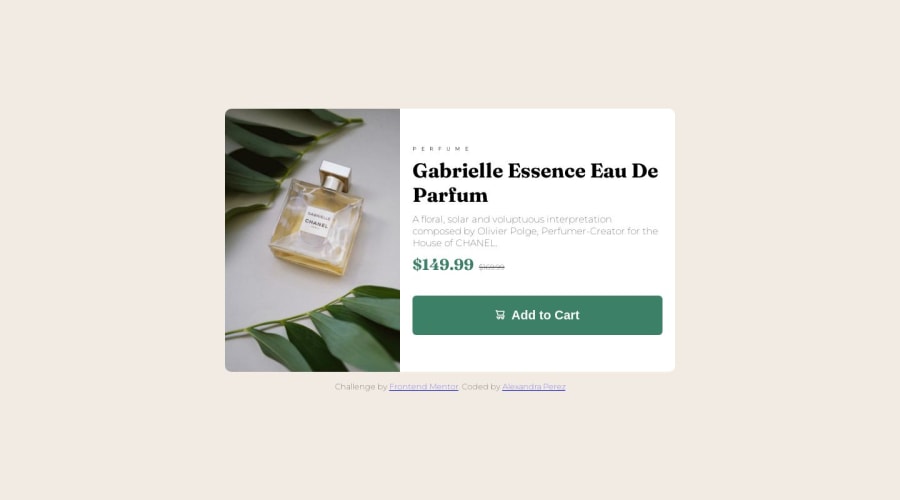
Design comparison
Solution retrospective
- Originally I struggled with optimizing for mobile/using CSS media query, since I built this with desktop-viewing in mind first.
Community feedback
- @jatinahluwaliaPosted about 1 year ago
Hey! Great work! For your size of the card, as we know by default <main> element takes up full width of it's container which is <body> in this case. To fix this you can give your body a display of flex and center the card using justify content and align items property on <body> element so that your product card now has a dynamic width and height based on it's content and it's also center on the screen. Hope this helps! You can also see my solution from my profile for this problem for reference!
Marked as helpful0 - @Aedan5621Posted about 1 year ago
Hello, you can declare the height and width of the container and the image until they meet your expectations, i don't think it's the best practice but it works, over time you can find other ways to do it, I'm in the same situation. For more information about the media queries, . Check this video to learn about the CSS Media Queries (https://youtu.be/2KL-z9A56SQ)
0@alexandra-perezPosted about 1 year ago@Aedan5621 Hi thanks for linking this video as I'm learning CSS basics but haven't yet come across anything on media queries so this was helpful!
1
Please log in to post a comment
Log in with GitHubJoin our Discord community
Join thousands of Frontend Mentor community members taking the challenges, sharing resources, helping each other, and chatting about all things front-end!
Join our Discord
