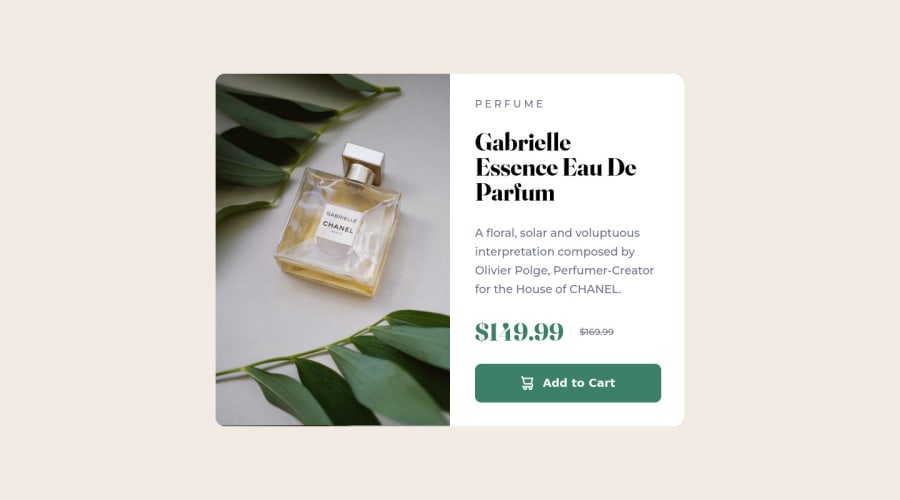
Design comparison
SolutionDesign
Solution retrospective
This one came out perfectly, only flaw is no mobile version as i don't know how to do that yet, any tips?
Community feedback
- @AlexKR7Posted over 2 years ago
Hello Caio, congratulations on your project
To make the web responsive you could use media query
for instance:
@media (max-width: 650px){


    .container{


        background-color: aqua;

    }

}
Try to put this code, you will see that when you make it smaller the background color changes.
You must adapt it to make it look the way you want.
I hope I've helped
Marked as helpful1
Please log in to post a comment
Log in with GitHubJoin our Discord community
Join thousands of Frontend Mentor community members taking the challenges, sharing resources, helping each other, and chatting about all things front-end!
Join our Discord
