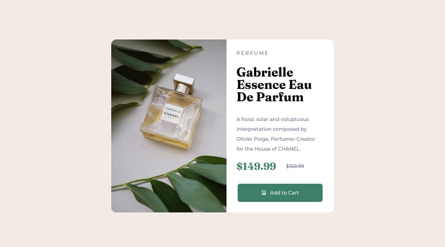
Design comparison
Solution retrospective
I am still unsure about the units I should be using when sizing, so I went ahead and used rem and em instead of px.
Community feedback
- P@jefflangtechPosted almost 2 years ago
Hey Jonfernando, nice work! I wanted to respond to your note about rem's and em's vs pixels because I went through the same thought process. Lately I've been only using rem's and here's how I set it all up:
- Find out what the base font-size should be (in px) and set that in my :root. This size in pixels will often be a very common denominator of all the other sizes used in the design.
- Create a spreadsheet where I can calculate the rem's for other elements based on my root font-size
I personally like the idea of rem's because I know that everything will be relative to the :root font-size.
And I checked out your CSS and the only thing I noted was you have a lot of separate rules with:
font-family: 'Montserrat', sans-serif;Maybe throw that into the body and only change the font-family on the other elements as needed? Just a thought to save you some typing.
Happy coding!
Marked as helpful1 - @Chermann-KINGPosted almost 2 years ago
👋Salut @Jxnfernandx
Here are some tips with case studies for choosing units in CSS
1.Pixels (px):
Practical case:
.container { width: 300px; }-Advantages: Precise and easy to understand, pixels are commonly used to define fixed dimensions. -Disadvantages: Dimensions defined in pixels do not adapt based on screen size or user preferences, which can lead to readability or layout issues on some devices.2.Percentage (%):
Practical case:
.container { width: 50%; }-Advantages: Percentages allow for fluid layouts that adapt to the screen size. They are particularly useful for responsive designs. -Disadvantages: It can be difficult to predict the exact appearance of elements with percentage-based dimensions, especially if the parent container dimensions are not clearly defined.3.Em (em):
Practical case:
p { font-size: 1.5em; }-Advantages: "Em" units are based on the font size of the parent element, allowing for designs that adapt to the user's font size preferences. -Disadvantages: Dimensions defined in "em" can be difficult to manage, especially when nested within multiple levels of parent elements.4.Rem (rem):
Practical case:
p { font-size: 1.2rem; }-Advantages: "Rem" units are similar to "em," but they are based on the font size of the root element (typically the <html> element). This avoids the nesting issues encountered with "em." -Disadvantages: As with "em," dimensions defined in "rem" can be less predictable than those defined in pixels.5.Viewport units (vw, vh, vmin, vmax):
Practical case:
.container { width: 50vw; }-Advantages: Viewport units allow for designs that adapt to the dimensions of the browser window, which is useful for fluid and responsive layouts. -Disadvantages: Dimensions defined in viewport units can be less predictable than those defined in pixels and may require additional adjustments to ensure proper layout on different devices.Each of these units has its own advantages and disadvantages, and it is often wise to combine them to create designs that adapt well to various devices and user preferences.
Good code😉
Marked as helpful1 - @0xabdulkhaliqPosted almost 2 years ago
Hello there 👋. Congratulations on successfully completing the challenge! 🎉
- I have other recommendations regarding your code that I believe will be of great interest to you.
HTML 🏷️:
- This solution may cause accessibility errors due to lack of semantic markup, which causes lacking of landmark for a webpage and allows accessibility issues to screen readers, due to accessibility errors our website may not reach its intended audience, face legal consequences, and have poor search engine rankings, highlighting the importance of ensuring accessibility and avoiding errors.
- What is meant by landmark ?, They used to define major sections of your page instead of relying on generic elements like
<div>or<span>. They are use to provide a more precise detail of the structure of our webpage to the browser or screen readers
- For example:
- The
<main>element should include all content directly related to the page's main idea, so there should only be one per page - The
<footer>typically contains information about the author of the section, copyright data or links to related documents.
- The
- So resolve the issue by replacing the
<div class="product-card">element with the semantic element<main>in yourindex.htmlfile to improve accessibility and organization of your page
.
I hope you find this helpful 😄 Above all, the solution you submitted is great !
Happy coding!
0
Please log in to post a comment
Log in with GitHubJoin our Discord community
Join thousands of Frontend Mentor community members taking the challenges, sharing resources, helping each other, and chatting about all things front-end!
Join our Discord
