

Design comparison
SolutionDesign

Solution retrospective
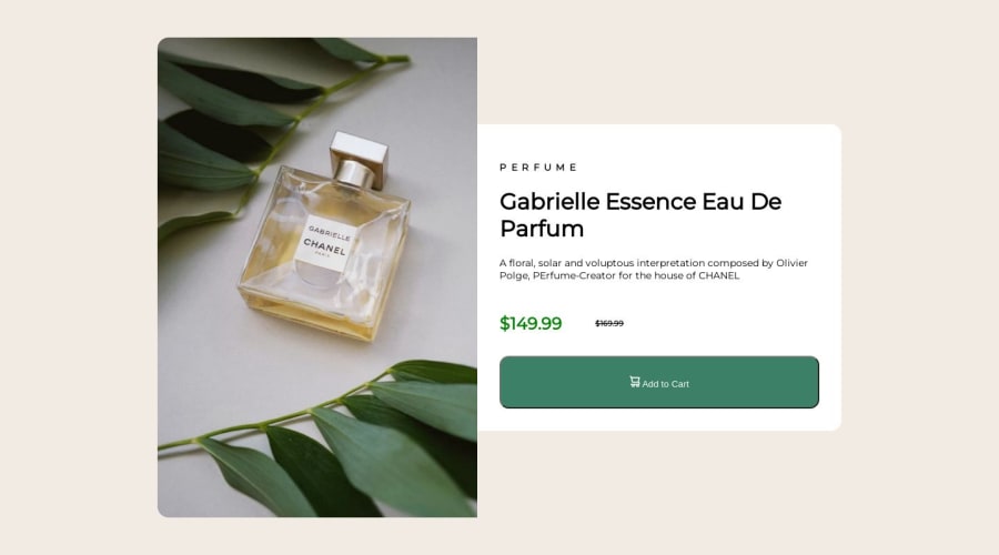
Found it difficult to get the image and second flex item to stay the same size upon scaling to different screen sizes. Any tips on using correct measurements and use of height/width are appreciated!
Community feedback
- @Aimal-125Posted over 1 year ago
Bro in your css code, make a main container and put the image div which is left one and the right div which includes text for the card in the main container. And give image div width: 40%; and text div width: 60%; And set the width of image to 100% and height to 100% and display: block to the <img> element. In this way image will remain intact on all screens.
0

Please log in to post a comment
Log in with GitHub
Join our Discord community
Join thousands of Frontend Mentor community members taking the challenges, sharing resources, helping each other, and chatting about all things front-end!
Join our Discord