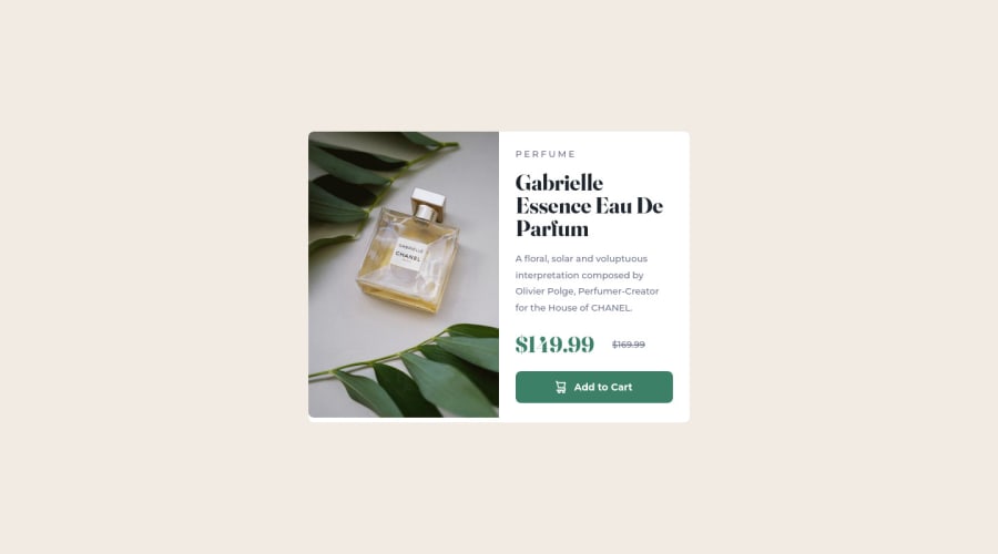
Design comparison
Solution retrospective
What did I find difficult while building the project?
- I found swapping images according to screen size hard difficult.
- Using the right units in CSS was quite difficult
- Adding google font to my HTML file.
Community feedback
- @iamenochleePosted over 2 years ago
you did a great job here, we all face such difficulties at first, as you engage in more exercise, it all be bygone, i notice some few stuffs;
- your image isn't quite fitting in the container, this is due to the padding in the article text, just a quick fix, apply
.image{
  height: 100%;
  background-size: cover
}

note its not a good practice to apply both height and width on images, but since this is 100%, you can get away with it.


2. You don't have to apply border-radius to the image also, remove the border-radius from the image, apply it only to the article container.


.article{
  border-radius: 10px;
  overflow: hidden;
}

overflow hidden will enforce the border-radius on all edges


congratulations on your first solution here, go through the solution reports and fix the issues.
keep coding mate.
Marked as helpful0@Tomi-AjaxPosted over 2 years ago@iamenochlee Thanks, your advice was really helpful. I apologize for the late reply. I mistakenly unpublished the webpage on Github any advice on getting it back?
0@iamenochleePosted over 2 years ago@Tomi-Ajax Yes you can, just go back to your pages, select the branch then save, that should republish it, let me know how it goes.
0
Please log in to post a comment
Log in with GitHubJoin our Discord community
Join thousands of Frontend Mentor community members taking the challenges, sharing resources, helping each other, and chatting about all things front-end!
Join our Discord
