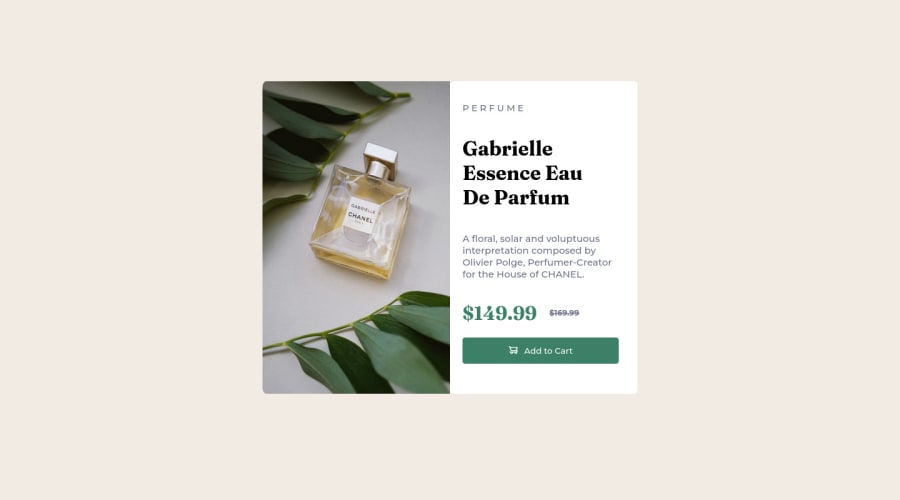
Design comparison
Solution retrospective
It was challenging to position the add to card image inside the button.
Community feedback
- @Remy349Posted about 2 years ago
The final result of the project is incredible, just a few tips:
- It looks like you forgot to add the responsive design for mobile devices.
- For the tag "<p id="title">P E R F U M E</p>", you can make that effect by adding the properties of "text-transform: uppercase" to make everything uppercase and "letter-spacing: (px/rem value)" to add a space between each letter.
Marked as helpful0@krishpri23Posted about 2 years ago@Remy349 Thank you so much for your valuable feedback. I was struggling to position the card to the center of the page, but managed to do so using margin-top. I tried align-items on the body but it did not work either. Is there a better way to position this?
0@Remy349Posted about 2 years ago@krishpri23 There are many ways to do it, one of them is to do it in the body adding "display: flex", "justify-content: center" and "align-items: center", but this will not work if you do not add a height to the body like the following "min-height: 100vh", the value "100vh" indicates that it will occupy all the available height of the browser screen.
Do this and don't forget to remove the margin you added.
-> I also leave you a link to learn more about the property "min-height" https://developer.mozilla.org/en-US/docs/Web/CSS/min-height
0
Please log in to post a comment
Log in with GitHubJoin our Discord community
Join thousands of Frontend Mentor community members taking the challenges, sharing resources, helping each other, and chatting about all things front-end!
Join our Discord
