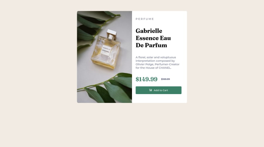
Design comparison
Solution retrospective
It was challenging to position add to card image inside button. Please pour your feedbacks
Community feedback
- @amalkarimPosted about 2 years ago
Hi Krishpri, congratulations for you solution!
Yeah, I agree, elements positioning could be really challenging. Thanks to flex, we could place image inside a button quite easily. First, you can remove all existing styles for
<div id="card-img">because we won't need them. Then, give this styling below to the button:#btn { display: flex; align-items: center; justify-content: center; gap: 10px; }Then, remove
padding: 10px 70px 10px 70px 10px;from#btn.Also, to make the card center both horizontally and vertically, we can use flex again. Remove these style from
<div class="card">:margin-left: auto; margin-right: auto; margin-top: 130px;Then give styles below to
<body>:display: flex; align-items: center; justify-content: center; min-height: 100vh;Hope this helps
Marked as helpful0
Please log in to post a comment
Log in with GitHubJoin our Discord community
Join thousands of Frontend Mentor community members taking the challenges, sharing resources, helping each other, and chatting about all things front-end!
Join our Discord
