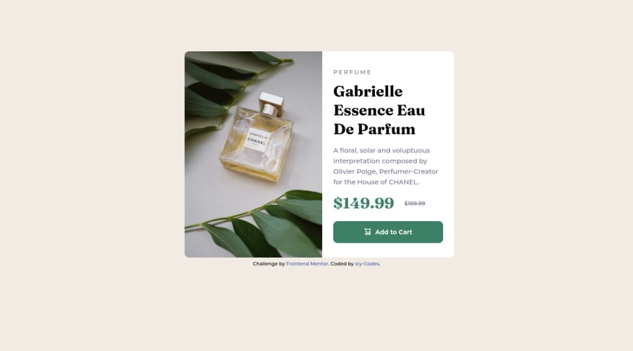
Design comparison
Solution retrospective
I had(have) serious issues with styling the mobile view product image for a really long time now, so I went on to use the desktop view image; in simpler words, I don't know how to use different images when making a site responsive; I'd really appreciate any help on this.
Community feedback
- @hyrongennikePosted about 2 years ago
HI,
On mobile the image is being is not displaying correctly just add object-fit.
#perfume {
    margin: 0 auto;
    width: 350px;
    height: 240px;
    border-radius: 10px 10px 0 0;
    object-fit: cover;
}
this will make sure the image does not distort and covers the container you can use this on any image.
Marked as helpful1@Canice10Posted about 2 years ago@hyrongennike My goodness, thank you!😭😭 I never came across this at all. Thanks a lot.
1 - @cacostedPosted about 2 years ago
Hello @Canice10, your solutions looks great. congrats 🎉
I saw that you have some problems with the mobile picture. There are different was to solve this problem. I can think of two right now that could be helpful for you.
- The first one is to use the
<picture>tag, this allows you to render an image depending on the screen size or "breakpoint". Here you have an example on how to use it, you set a<source>with a media(screen size) then the srcset(the image to show on this screen size)
<picture> <source media="(min-width:1300px)" srcset="./large.jpg1" /> <source media="(min-width:1000px)" srcset="./medium.jpg"/> <img src="./img.jpg" alt="Image Description"> </picture>- Using media queries with
background-image, this is another approach, you could set a media queries where it sets a differenturlbase on the screen size.
.image-container {
  background-image: url('small.jpg');
}
media(min-width: 800px) {
  .image-container {
    background-image: url('medium.jpg');
}
}
The only problem with this last solution is that you would have to set the size of the image container by hand to be able to see the image, and the image would not be accessible by screen readers, so be aware of this.
Marked as helpful1 - The first one is to use the
- Account deleted
Hi Canice, Congratulations for your solution. :)
For changing the images you can use the <picture> tag, for example:
<picture> <source media="(min-width:650px)" srcset="images/image-product-desktop.jpg"> <img src="images/image-product-mobile.jpg" alt="..." class="..."> </picture>/Or another solution is that you can add both to the HTML page, and you can hide them in CSS.
for example:
HTML:
<img src="images/image-product-desktop.jpg" class="img-desktop" />
<img src="images/image-product-mobile.jpg" class="img-mobile" />
CSS:
@media (max-width: 650px) { .img-desktop { display: none; }}
@media (min-width: 650px) { .img-mobile { display: none; }}
Marked as helpful1
Please log in to post a comment
Log in with GitHubJoin our Discord community
Join thousands of Frontend Mentor community members taking the challenges, sharing resources, helping each other, and chatting about all things front-end!
Join our Discord
