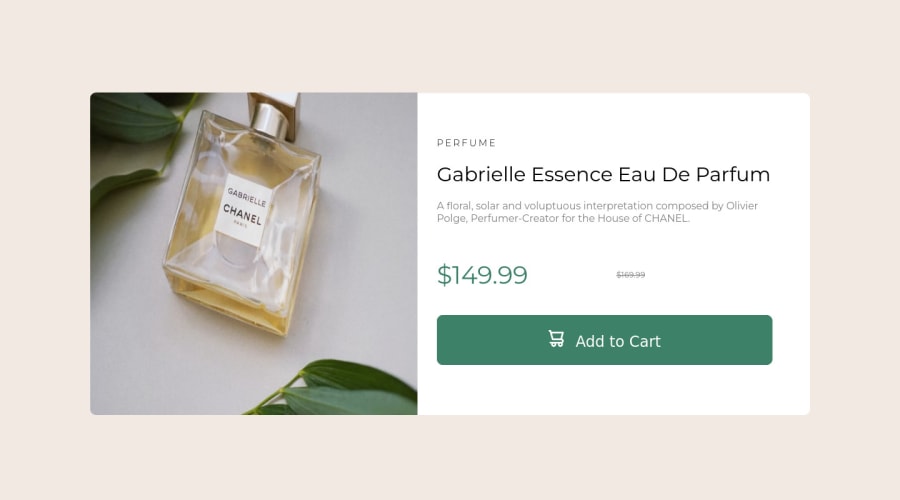
Design comparison
Solution retrospective
I tried designing this mobile first and would like feed back on how I did overall code wise.
Also the design I was given in sketch looks different than the one the site shows, I'm not sure if it's because I don't have certain fonts or not, but I followed what the Sketch design showed
I'm also confused as to why when I start to stretch the page towards desktop the main image starts moving a bit
Community feedback
- @gvneePosted over 2 years ago
Font might be looking different because of font-weight. Check out the style-guide And give your container max-width so it won't stretch. Also it seems that it is changing to mobile design at 900px. Even some desktop screen width is around 700px so checkout popular breakpoints and screen sizes.
1 - @IseistaPosted over 2 years ago
Hola. Te quedo bien el diseño el manejo de la parte móvil y desktop Aunque te puedo sugerir usar Paint para que las medidas en pixeles sean lo mas reales con el diseño. El manejo de etiquetas span te quedo bien
1
Please log in to post a comment
Log in with GitHubJoin our Discord community
Join thousands of Frontend Mentor community members taking the challenges, sharing resources, helping each other, and chatting about all things front-end!
Join our Discord
