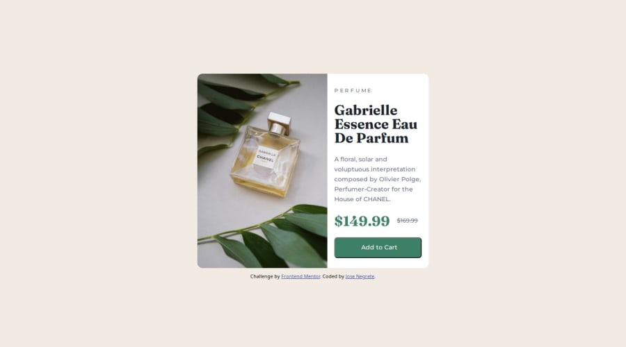
Design comparison
Solution retrospective
Most proud of better using the media queries. Next time focus more on figuring out how to group HTML elements for desktop design.
What challenges did you encounter, and how did you overcome them?A challenge I encountered was figuring out the sizes of certain areas. Overcame this with use of width: in CSS.
Any tips would be welcomed, but if I had to choose probably the height: in the @media section and wondering if that's needed?
Please log in to post a comment
Log in with GitHubCommunity feedback
- @Thomas-Ngo-1
Your container looks very nice, if you can make it center of the page by adding the code below to the container it would be perfect:
justify-content: center; /* Center horizontally / align-items: center; / Center vertically */Marked as helpful
Join our Discord community
Join thousands of Frontend Mentor community members taking the challenges, sharing resources, helping each other, and chatting about all things front-end!
Join our Discord
