Submitted over 2 years ago
Product preview card solution using pure HTML5 & CSS3

@AgusSaMac

Design comparison
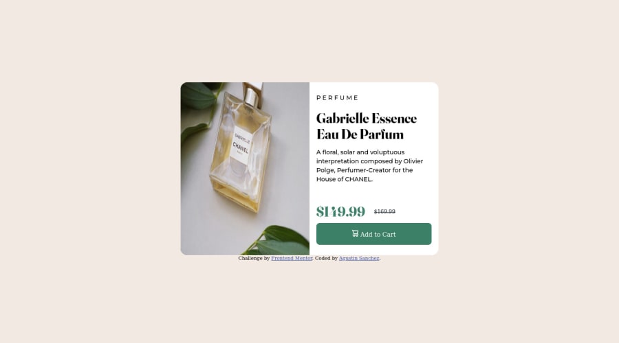
SolutionDesign

Solution retrospective
This is my second project, I used no framework on this project.
I would appreciate some feedback, specially with responsive text, I'm still struggling with it.
Thank you for your time,
Have a great day!
Community feedback
- @dgjenni2Posted over 2 years ago
Solution looks good. Did notice a couple small things.
- The header and the paragraph content appear to be a lighter gray color rather than the default black. This could be fixed by overwriting the default text color for the page or creating a css tag to change text color.
- The width on the next content on desktop appears to be a bit too wide. Shrinking that down so margins the can a bit wider would fit the design better.
- The strike through text was done via css, although you could have potentially used the <s> tag to have the same effect without creating the extra tag. Not wrong, just another potential solution. More on strikethrough html tags here: https://www.w3schools.com/tags/tag_strike.asp
1@AgusSaMacPosted over 2 years ago@dgjenni2 Hello! I will take your observations into account, and be more careful with the color scheme. Never considered the <s> tag I'm checking the link as soon as I finish this message. Thank you.
Have a great day!
0

Please log in to post a comment
Log in with GitHubJoin our Discord community
Join thousands of Frontend Mentor community members taking the challenges, sharing resources, helping each other, and chatting about all things front-end!
Join our Discord