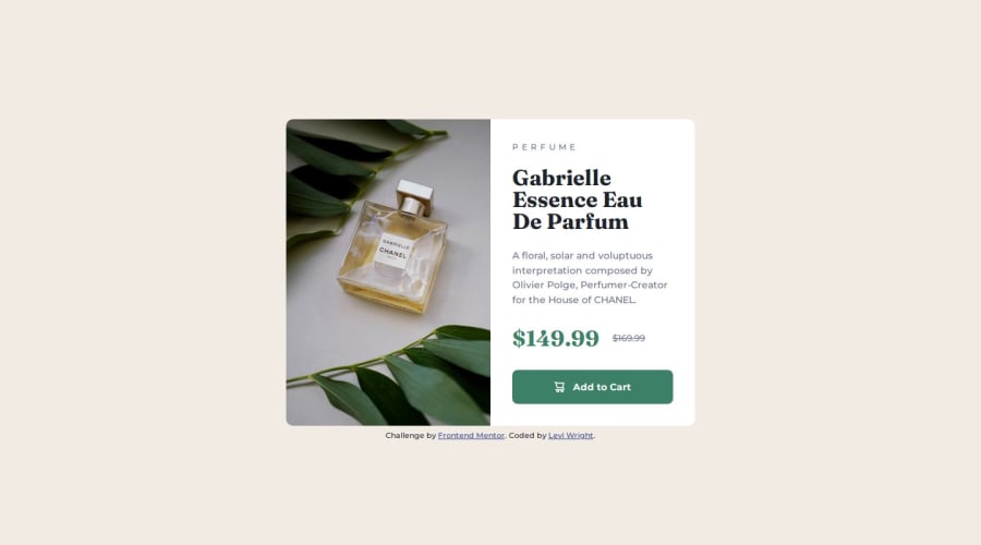
Design comparison
Solution retrospective
The product image looks a bit different in terms of color in the design screenshots, so I got the image closer to that using filter:
filter: brightness(90%) contrast(115%);
I was able to get the heights and widths of the card exactly right, but the line spacing in the description paragraph is slightly off consequently. Next time, I'd perhaps decrease some margin values a bit and increase the line spacing.
What specific areas of your project would you like help with?This is the first challenge where I really tried to adhere to the BEM naming convention. I would like to know where I could improve with both that and overall code readability. I would also like to know if I used the em unit properly (I used it for letter spacing on the ribbon text and for setting the height/width of the cart image in the button).
Community feedback
- @grace-snowPosted 6 months ago
Hi, I hope this feedback helps
- 90rem is way too late to be adding the media query in this. Change the layout as soon as there is room for it to change. As it is now, I see the mobile solution even on my laptop! I'd expect the layout to change somewhere around 40-44rem.
- Don't set explicit sizes on the picture element or img. It should be
height: 100%on larger screens and that is the only change needed. - I'm surprised you've needed to add a filter on the image... Is that in the design? It's not something I've seen before on other challenge submissions for this.
- Neither half of the card should need a max-width. You should only need a max-width on the card itself.
- It would be slightly shorter CSS in this challenge if you used grid for the card layout instead of flexbox. It is much shorter to get two equal width columns in one line of css on the parent (
grid-template-columns: 1fr 1fr) than to use flexbox which should then have flex- properties (grow / shrink / basis) or widths on the child elements. - If you make the text half of the card into a flex column, you can use
margin-top: autoon the button to ensure it always sits at the bottom of the card. This is less important when viewing this component in isolation, but becomes important when you consider that a grid of product cards like this on an e-commerce site may have products each with different length descriptions or titles. The alignment of the button should always be consistent across multiple cards.
Marked as helpful2P@law973Posted 6 months ago@grace-snow Thank you for the feedback! It is very helpful, and I've changed the solution to reflect it.
As for the filter, there's nothing in the design files that explicitly indicates a need for that. However, there is a difference in lighting/contrast between the unfiltered image (on the left) and the design screenshot (on the right). It's not the easiest thing to notice, but it's quite clear if they're overlapped on different layers in an image editor and the visibility of the top layer is toggled. I don't imagine it was meant to be taken into account, but it is there all the same.
1
Please log in to post a comment
Log in with GitHubJoin our Discord community
Join thousands of Frontend Mentor community members taking the challenges, sharing resources, helping each other, and chatting about all things front-end!
Join our Discord
