Not Found
Not Found
Not Found
Not Found
Not Found
Not Found
Not Found
Not Found
Not Found
Not Found
Not Found
Not Found
Not Found
Not Found
Not Found
Not Found
Not Found
Not Found
Not Found
Not Found

Submitted

Product preview card responsive with grid/flex layout and animation

@VincenzoMuolo

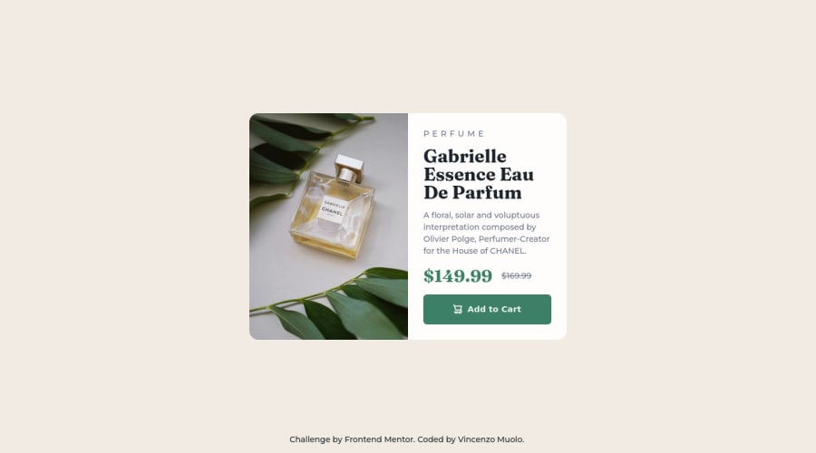
Desktop design screenshot for the Product preview card component coding challenge

This is a solution for...

  • HTML
  • CSS
1newbie
View challenge

Design comparison


SolutionDesign

Solution retrospective


Hi! If someone have any suggestion or best practice to share reply here if you want to, Thanks! Another thing, should i look for some particular framework? Or is better to achieve this challenges with only css, html and js?

Community feedback

@VCarames

Posted

Hey there! 👋 Here are some suggestions to help improve your code:

Regarding you question,

Learn and fully grasp the fundamentals of HTML and CSS. Once you understand them and know how they work, I would then recommend learning a framework. Frameworks are built on the fundaments of HTML and CSS.

  • The purpose of the Main Element is to identify the main content of your page. It is not the container of you component. After the main element, you want add a container to wrap you separate components in.

  • The Alt Tag Description for the image needs to be improved upon. You want to describe what the image is; they need to be readable. Assume you’re describing the image to someone.

  • This challenges requires the use of two images 🎑 for different breakpoints. The Picture Element will facilitate this.

Here is an example of how it works: EXAMPLE

Syntax:

  <picture>
    <source media="(min-width: )" srcset="">
    <img src="" alt="">
  </picture>

More Info:

https://www.w3schools.com/html/html_images_picture.asp

https://web.dev/learn/design/picture-element/

  • The old price 🏷 is not being announced properly to screen readers. You want to wrap it in a Del Element and include span element with an sr-only text explaining that this is the old price.

  • The "shopping cart" icon 🛒 is decorative, so its Alt Tag should left blank and have an aria-hidden=“true” to hides it from assistive technology.

  • Implement a Mobile First approach 📱 > 🖥

With mobile devices being the predominant way that people view websites/content. It is more crucial than ever to ensure that your website/content looks presentable on all mobile devices. To achieve this, you start building your website/content for smaller screen first and then adjust your content for larger screens.

If you have any questions or need further clarification, let me know.

Happy Coding! 👻🎃

Marked as helpful

0

@VincenzoMuolo

Posted

@vcarames Before all, thanks for this exhaustive answer!

I really appreciate it.

Honestly i get a bit confused for the main tag use, exactly how you said i used it as my container, mostly because in my first project i don't used at all, and the report gave me the warning, so i re-organized all my content in the main tag without caring too much of what really needs to be in there, but now i'll use it properly!

The alt tag is totally on me, also this one was suggested by the report and i've added it with a generic description, but from now i'll describe as you said.

For the image, i used object-fit and object-position to handle it, and as the result seems to work decently scaling the resolution, i though that is not necessary to load another image, but yes i should've used it, and the snippet you gave me is interesting, i'ill try it!

For the old price answer i saw your solution, del is a new thing to me, i'ill check more for this in order to use it properly.

For the alt on the shopping cart is related of what i said before, in the doc says that there are situation were is not necessary, but i skipped it, i'll correct this one too!

Thanks again for your answer, and sorry if i made any grammatical incorrectness, but i'm also practicing my english skill too by interacting with you.

0

@engjell17

Posted

hellow there you need to look again in your page because:

1-the text inside your paragraph and h1 has collapsed! 2-your animation are beautiful!(very good)! 3-your image doesn't load! and the text inside your button has also collapsed! if you need further clarification please feel free to contact me!

0

@VincenzoMuolo

Posted

@engjell17 Hi, thanks for you answer, the elements you mentioned are mostly the ones where the accessibility and html validation report found errors, now i've solved them all, there still problems? Looks fine to me now, but i'm new here so maybe i just don't know were the problem exaclty is. Also, for the animations you can check this link!

HERE

0

Please log in to post a comment

Log in with GitHub
Discord logo

Join our Discord community

Join thousands of Frontend Mentor community members taking the challenges, sharing resources, helping each other, and chatting about all things front-end!

Join our Discord