

Design comparison

Solution retrospective
I'm happy to receive feedback on how to further improve my work :)
Community feedback
- @dar-juPosted about 2 months ago
Hi praises1!
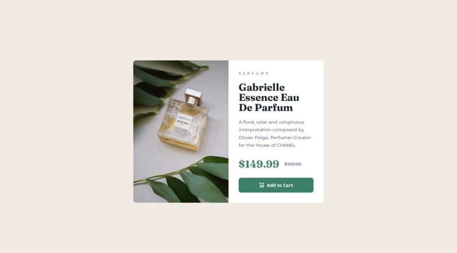
You did well! I liked how you connected the icon to the button using a custom attribute.
-
Look at the resolution 600-634 pixels, the image is not the full height of the block. I'm sure you know how to fix it )
-
For prices, I would not use the paragraph tag, span is more suitable.
-
As a recommendation: for .btn, use
transition: background-color ease-in-out 0.3s;- this will give smoothness to the hover, interaction with active elements will be more pleasant for the user
Otherwise, great work, good luck with the development!
Marked as helpful0 -
- P@olaide-hokPosted about 2 months ago
Kindly consider adding accessibility considerations Issue: The button hover effect changes the background color but doesn’t account for contrast or focus states.
Fix: Add focus styles and ensure sufficient contrast for accessibility.
.btn:focus {
    background-color: var(--clr-primary-500);
}
Marked as helpful0


Please log in to post a comment
Log in with GitHubJoin our Discord community
Join thousands of Frontend Mentor community members taking the challenges, sharing resources, helping each other, and chatting about all things front-end!
Join our Discord