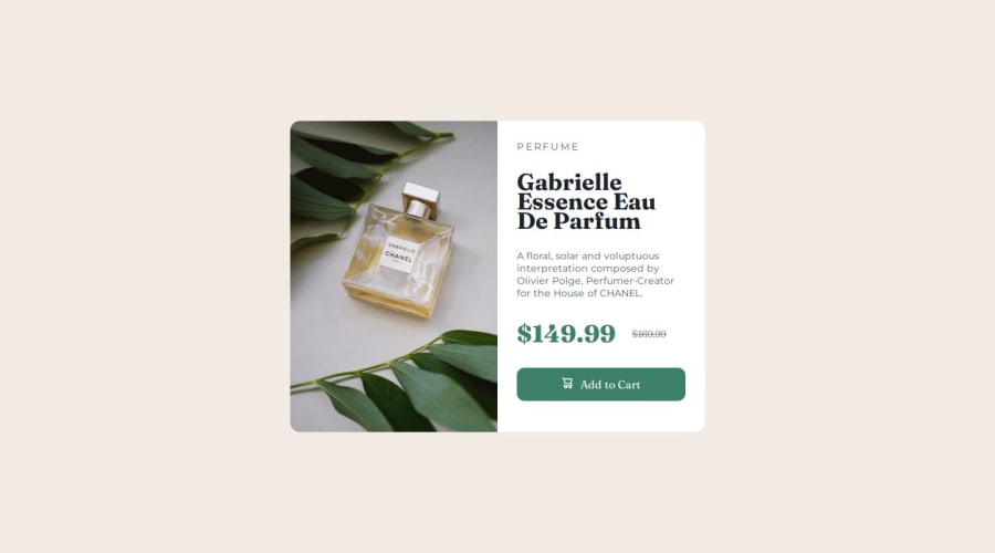


Design comparison

Community feedback
- @Augurk66Posted 5 months ago
Very good job on this one!
You can save a lot of lines of code in your CSS by declaring media queries once. It is possible to declare
@media (max-width: 635px) { }once an write all your CSS in that declaration.Even better is to start building mobile first without declaring anything and eventually adjust some CSS with a media query for bigger screen. But it can also be a personal preference. Check out Kevin Powell on YouTube, I think he can explain this topic more in detail.
A tip on details: the crossed out price and button text has Montserrat as Font-Family.
Good luck on the next one!
Marked as helpful0P@ismailhasirPosted 5 months agoHello @Augurk66.
You are %100 right about the mobile first approach.I realized my mistake when i am about to finish the project.And thank you for the advice for media queries.I will check in my mind on the next projects.
Thank you for your feedback.It was very helpful.
Have a nice day!
0

Please log in to post a comment
Log in with GitHub
Join our Discord community
Join thousands of Frontend Mentor community members taking the challenges, sharing resources, helping each other, and chatting about all things front-end!
Join our Discord