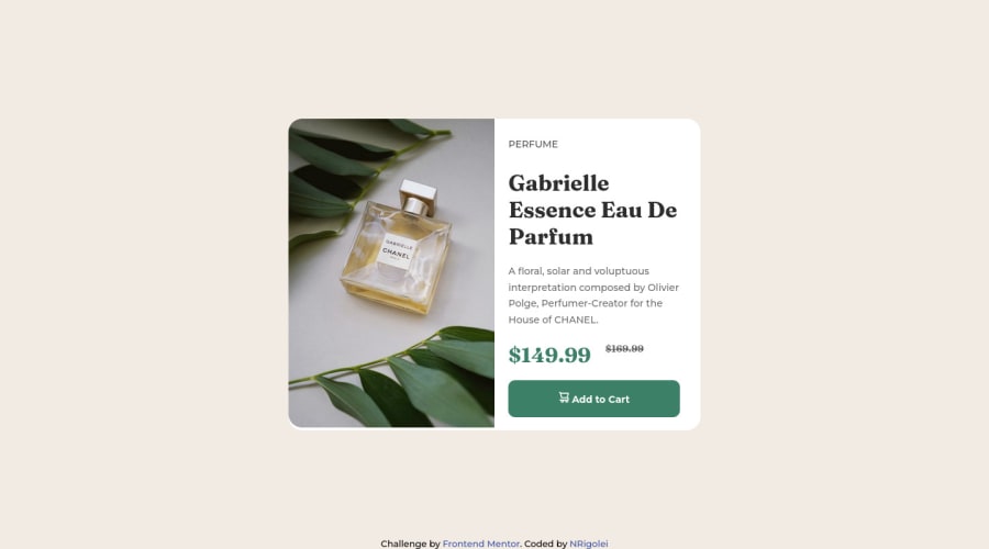


Design comparison
SolutionDesign

Solution retrospective
the most difficult thing for me was the positioning of the elements, I'm still learning about it. and the responsiveness is still questionable
Please log in to post a comment
Log in with GitHubCommunity feedback
- @pRicard0
Alguns erros/sugestões em HTML
- Você poderia utilizar footer ao invés da div com classe "attribution".
- Poderia utilizar button ao invés de uma div com a classe btn
- Ao invés de usar span, você pode usar em para dar o significado de ênfase àquele valor e utilizar s que significa tachado. Uma palavra ou numero com o risquinho no meio significa tachado, isso representa algo que não é mais relevante.
Alguns erros/sugestões em CSS
- Para font-size é recomendado utilizar rem.
- Se quiser aprender a posicionar melhor, aprenda flexbox. Se quiser aprender flexbox rápido e de uma maneira interativa, fazendo exercícios, clique aqui
Espero ter ajudado. Seu projeto está até que bem. Geralmente quem não sabe flexbox tende a errar mais. Parabéns.
Marked as helpful

Join our Discord community
Join thousands of Frontend Mentor community members taking the challenges, sharing resources, helping each other, and chatting about all things front-end!
Join our Discord