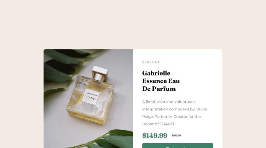


Design comparison
SolutionDesign

Solution retrospective
What are you most proud of, and what would you do differently next time?
a
What challenges did you encounter, and how did you overcome them?i am struggle with background-image sizing and adapt size to responsive
What specific areas of your project would you like help with?a
Community feedback
- @danielmrz-devPosted 7 months ago
Hello, @muqsith3!
Your project is looking fantastic!
I'd like to suggest a way to make it even better:
- Using
marginisn't always the most effective method for centering an element.
Here's a highly efficient approach to position an element at the center of the page both vertically and horizontally:
📌 Apply this CSS to the body (avoid using
positionormarginsin order to work correctly):body { min-height: 100vh; display: flex; justify-content: center; align-items: center; }I hope you find this helpful!
Keep up the excellent work!
Marked as helpful1 - Using
- @wcyin9Posted 7 months ago
Hello there! You did a good job with the structure overall. Keep up the great work!
To provide you with some aid regarding responsive design and image sizing:
- since the design is full screen with no scroll needed, you can get rid of the scroll bar in your own code. To do this, you add
height: 100vh;andoverflow: hidden;to thebodyselector in css. This will get rid of the scrollbar and keep the card fullscreen. - adding a max-width to the container will keep the card from being too big. The given width of the card in desktop is 343, whereas the width in the mobile is 600. Thus, you can add
max-width: 600px;to your mobile container, andmax-width: 343px;to your desktop container. - for your images, you can use
picturetag in your html and implementsource srcset="image.png" media="(min-width: number)". This website explains how you use that element perfectly. The purpose of adding that code is so the image automatically switches with the media query. In addition, you can addmax-width: 100%;toimgin CSS to ensure it will never overflow the container.
Marked as helpful1 - since the design is full screen with no scroll needed, you can get rid of the scroll bar in your own code. To do this, you add


Please log in to post a comment
Log in with GitHub
Join our Discord community
Join thousands of Frontend Mentor community members taking the challenges, sharing resources, helping each other, and chatting about all things front-end!
Join our Discord