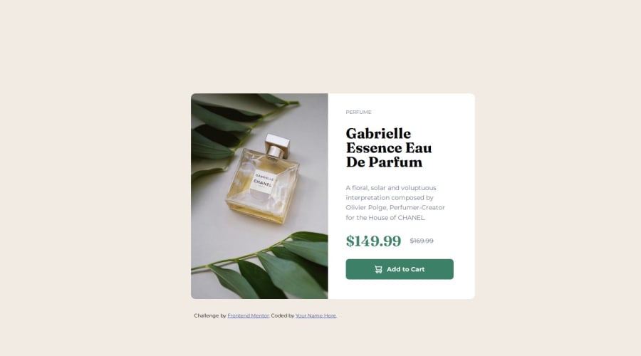


Design comparison

Solution retrospective
This was the first Frontend Mentor project where I took a mobile-first approach. I think the look of the preview card for mobile and desktop screen sizes is well accomplished. Also this didn't take as much time as I thought it would, even though I could still invest a little more time in polishing some bits.
What challenges did you encounter, and how did you overcome them?The whole going from mobile to desktop was a bit of a challenge. However, the trickiest part was changing the img element's src according to the screen size. Ultimately I found a simple solution, but it took me a bit of time to figure it out.
What specific areas of your project would you like help with?Same as last time, the breakpoints for media queries are still something I struggle with. Also, for the sake of brevity, I just used the breakpoints for 475 and 1024px screens, so the transition from one to the other is really messy. I intend to work on implementing a solution to make the whole transition more steadily responsive.
Please log in to post a comment
Log in with GitHubCommunity feedback
No feedback yet. Be the first to give feedback on alvarozama's solution.
Join our Discord community
Join thousands of Frontend Mentor community members taking the challenges, sharing resources, helping each other, and chatting about all things front-end!
Join our Discord