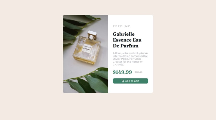


Design comparison

Community feedback
- @R3ygoskiPosted 7 months ago
Hello Swati, congratulations on completing your challenge, it looks great.
I'd like to give you some suggestions to make it a bit closer to the proposed design. You can consider reducing the
min-heightof.part-1to around460px. This will make it misaligned, so to center it, you can usedisplay: flex;,justify-content:center;, andalign-items: center;on thebody, and then add aheight: 100vh. With this, your card will be perfectly centered. You can also remove themarginfrom your.container.As for your HTML, it's well-structured, but it lacks some semantics, which are extremely important for SEO and accessibility. Here are some tags that can be changed:
<div class="container">could be changed to<main>because it contains the main content of the page.<div class="part-1">: Here, you could use a<figure>, as the content of this part is an illustration.<div class="part-2">: Here, you could use an<article>, as the content here is self-explanatory and independent of the rest of the page.<div class="btn">: Here, you could use the<button>tag itself, as it makes more sense to be a button rather than a<div>. But if you want to keep the div, you can add arole="button"attribute to make it more accessible to screen readers.
Regarding accessibility, I noticed that you used two heading tags
<h1>, which can result in accessibility errors. We should only have one<h1>, so it would be more appropriate to replace the price section with<h2>or<span>, as it makes more sense to be a<span>than a subheading (h2).Again, congratulations! Keep practicing and improving your skill. If you have any questions, please ask below and I will try to help in the best possible way.
Marked as helpful0@Swati7819Posted 7 months agoHello Bernardo! Thank you for the appreciation and the suggestions. I will surely look into it and will work in that direction !!
Cheers !
1

Please log in to post a comment
Log in with GitHubJoin our Discord community
Join thousands of Frontend Mentor community members taking the challenges, sharing resources, helping each other, and chatting about all things front-end!
Join our Discord