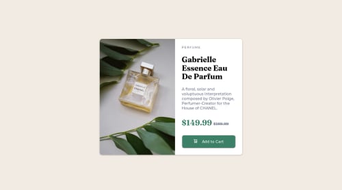
Product Preview Card | Media Queries | CSS Custom Properties
Design comparison
Solution retrospective
It's better to open just one media and put everything there or to break then apart? (like I did?) How do you structure this?
Thanks!
Community feedback
- @correlucasPosted about 2 years ago
👾Hello @aecio-neto, Congratulations on completing this challenge!
Your solution its almost done and I’ve some tips to help you to improve it:
A better way to work this solution image, the product image is by using
<picture>
to wrap it on the html instead of using it as<img>
orbackground-image
(with the css). Using<picture>
you wrap both images (desktop and mobile) and have more control over it, since you can set in the html when the images changes setting the screen size for each image.ote that for SEO / search engine reasons isn’t a better practice import this product image with CSS since this will make it harder to the image.Here’s the documentation and the guide to use this tag:
https://www.w3schools.com/tags/tag_picture.asp
See the example below:
<picture> <source media="(max-width:650px)" srcset="./images/image-product-mobile.jpg"> <img src="./images/image-product-desktop.jpg" alt="Gabrielle Parfum" style="width:auto;"> </picture>
👨💻Here's my solution for this challenge if you wants to see how I build it: https://www.frontendmentor.io/solutions/product-preview-card-vanilla-css-and-custom-hover-state-on-hero-85A1JsueD1
✌️ I hope this helps you and happy coding!
0
Please log in to post a comment
Log in with GitHubJoin our Discord community
Join thousands of Frontend Mentor community members taking the challenges, sharing resources, helping each other, and chatting about all things front-end!
Join our Discord