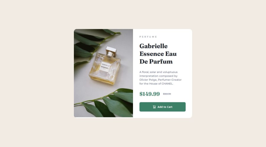
Design comparison
Please log in to post a comment
Log in with GitHubCommunity feedback
- P@Islandstone89
Hi, good job!
A few suggestions:
HTML:
-
"Perfume" is a
<p>, and should be written with normal capitalization. Style it in CSS usingtext-transform: uppercase. -
The 2 different prices might confuse a screen reader since the old price is indicated using a visual cue. To make it clearer, I would add
<span class="visually-hidden">Old price: </span>, with the following styles applied:
.visually-hidden {
    clip-path: inset(50%);
    overflow: hidden;
    position: absolute;
    white-space: nowrap;
    width: 1px;
    height: 1px;
}
Here is an article that explains what each of the properties does.
- Since the cart icon is purely decorative, the alt text should be empty:
alt="". The button gets its accessible name from the "Add to cart" text.
CSS:
-
Including a CSS Reset at the top is good practice.
-
I recommend adding a bit of
padding, for example16px, on thebody, to ensure the card doesn't touch the edges on small screens. -
On the
body, changeheighttomin-height: 100svh- this way, the content will not get cut off if it grows beneath the viewport. -
On the button, it's recommended to use
border: transparentinstead ofborder: none. -
I would set
font-sizein rem instead ofem. Remember, settingfont-sizeinpxcauses major accessibility issues. -
Media queries should be in
emorrem. -
Remember, inside a media query you don't need to repeat already set declarations. Thus, you can remove
display: flexandjustify-content: centeronbody, as well asdisplay: flexon the card.
Marked as helpful -
- @ManojSinghDashauni
good
Join our Discord community
Join thousands of Frontend Mentor community members taking the challenges, sharing resources, helping each other, and chatting about all things front-end!
Join our Discord
