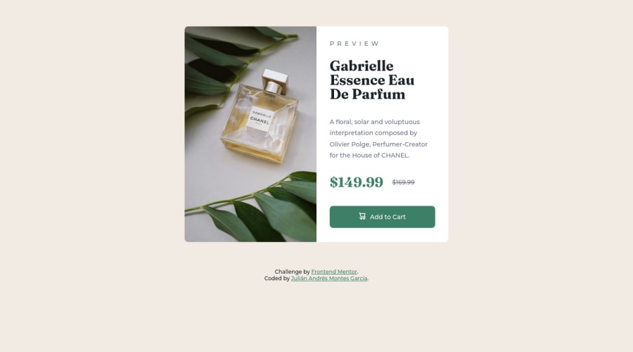
Product Preview Card | HTML CSS Flexbox
Design comparison
Solution retrospective
Quisiera conocer tú opinión de mí solución, coméntame.
Community feedback
- @correlucasPosted about 2 years ago
👾Hello @JuliMontes, Congratulations on completing this challenge!
Your solution its almost done and I’ve some tips to help you to improve it:
1.Use units as
rem
orem
instead ofpx
to improve your performance by resizing fonts between different screens and devices.To save your time you can code your whole page using
px
and then in the end use a VsCode plugin called px to rem here's the link → https://marketplace.visualstudio.com/items?itemName=sainoba.px-to-rem to do the automatic conversion or use this website https://pixelsconverter.com/px-to-rem2.Use the THE PICTURE TAG that is a shortcut to deal with the multiple images in this challenge. So you can use the
<picture>
tag instead of importing this as an<img>
or using a div withbackground-image
. Use it to place the images and make the change between mobile and desktop, instead of using adiv
orimg
and set the change in the css withdisplay: none
with the tag picture is more practical and easy. Note that for SEO / search engine reasons isn’t a better practice import this product image with CSS since this will make it harder to the image. Manage both images inside the<picture>
tag and use the html to code to set when the images should change setting the devicemax-width
depending of the device desktop + mobile.Check the link for the official documentation for
<picture>
in W3 SCHOOLS:https://www.w3schools.com/tags/tag_picture.asp
See the example below:
<picture> <source media="(max-width:650px)" srcset="./images/image-product-mobile.jpg"> <img src="./images/image-product-desktop.jpg" alt="Gabrielle Parfum" style="width:auto;"> </picture>
👨💻Here's my solution for this challenge if you wants to see how I build it: https://www.frontendmentor.io/solutions/product-preview-card-vanilla-css-and-custom-hover-state-on-hero-85A1JsueD1
✌️ I hope this helps you and happy coding!
Marked as helpful1@JuliMontesPosted about 2 years ago@correlucas Hola, te agradezco por tu comentario con una explicación tan detallada, eso me ha ayudado a entender un poco mejor el uso de las etiquetas en HTML semántico.
He aplicado tus sugerencias y actualicé mi código.
Feliz codificación!
0 - @VCaramesPosted about 2 years ago
Hey @JuliMontes, some suggestions to improve you code:
- To center you content to your page, add the following to your Body Element:
body { min-height: 100vh; display: grid; place-content: center; }
- For this challenge you want to use the Picture Element not the Background Image Property. The Background Image Property is mainly used on decorative images
Picture Element will allow your to switch between images in different breakpoints and makes your site load faster by saving bandwidth.
Here is an example of how it works: EXAMPLE
Syntax:
<picture> <source media="(min-width: )" srcset=""> <img src="" alt=""> </picture>
More Info:
https://www.w3schools.com/html/html_images_picture.asp
https://web.dev/learn/design/picture-element/
- The old price 🏷 is not being announced properly to screen readers. You want to wrap it in a Del Element and include a sr-only text explaining that this is the old price.
Happy Coding! 👻🎃
1@JuliMontesPosted about 2 years ago@vcarames He tenido en cuenta tu consejo de cargar las imágenes con la etiqueta picture y he actualizado mi código con ello, gracias y feliz codificación.
0
Please log in to post a comment
Log in with GitHubJoin our Discord community
Join thousands of Frontend Mentor community members taking the challenges, sharing resources, helping each other, and chatting about all things front-end!
Join our Discord