

Design comparison

Solution retrospective
I did a good amount on research, did not approach it like "once it works, leave it".
That's the case, for instance, with the adequate use of the image for this specific use case (more on this in next answer).
Also, since there was a hint at using Sass (and similar stuff), I research and resolved that, in my individual case, it didn't work for me for this scenario, as what it provides as real added benefit (again, as perceived by me) was mixins combined with inheritance, but I didn't find this scenario would benefit a lot from that.
Another thing that I was happy with was, while I have been trying to get accustomed to using logical properties, I now paid special attention to (whenever possible, see comment on this on next answer) using only logical properties (like e.g. max-inline-size, etc.).
Probably what I would do differently next time is: if I have images that change according to screen size or anything involved in the layout, I would first do a very elemental mockup in smth like Codepen to decide on my layout strategy, and only then come here and do the challenge.
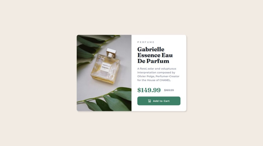
What challenges did you encounter, and how did you overcome them?I think my biggest challenge was with the image. Basically, having two different images but with no clear idea on any measurement (other than the two viewports provided) was challenging.
One of my approaches was with flexbox, although the obscure ways (aka: algorithm) in which the flex keyword calculates space allocation made it a bad fit when wanting to split perfectly half and half. (For more on this and why this happens, you can read this article of Kevin Powell on CSS-Tricks.
Another approach I took was with using a `` with background-image... and the sad thing is that worked just fine! But it wasn't appropriate, since the image was not decorative; it actually gives (visual) information to the user about the product.
So my final approach was a combination of using grid (with 2 columns of 1fr on larger viewports, to ensure a precise split) with a media query and, something that came across as pretty anti-pattern to me at least, was the necessity of using with in the HTML and having to specify the media query a second time... and inside HTML (?) but I read on it and it has to be there, so browser can interpret that when laying things on the page. It's in the HTML in the media attribute of the source element. (Of course, feel free to suggest me otherwise if there was smth I missed or misunderstood).
Another (not hugely related) discovery was that media queries do not (yet?) support logical properties. For example, even if you are encouraged to specify inline-size in your CSS, in your media query, you can't express it like @media (min-inline-size...; you have to go with @media (min-width.... If you want to read more on this, here you have a couple of interesting articles on it. And here is the latest media query draft from CSSWG, where they only mention min-width, etc., and there's no mention of logical properties.
Hmmm... anything. I think I solved everything I set out myself to get done. However, experience cannot be bought. So if you see this and find smth I could do better or take into account next time, please tell me.
Thank you!

Join our Discord community
Join thousands of Frontend Mentor community members taking the challenges, sharing resources, helping each other, and chatting about all things front-end!
Join our Discord