

Design comparison

Solution retrospective
Thinking through the entire structure before I even wrote a single line of code. And also keeping the code pretty clean, not using unnecessary class-names and id's.
What challenges did you encounter, and how did you overcome them?Not having the proper images delivered. I solved it with using the proper one, and then cropping and scaling it with a container and transform.
What specific areas of your project would you like help with?How could I make this card even more accessible?
Community feedback
- @catherineisonlinePosted 9 days ago
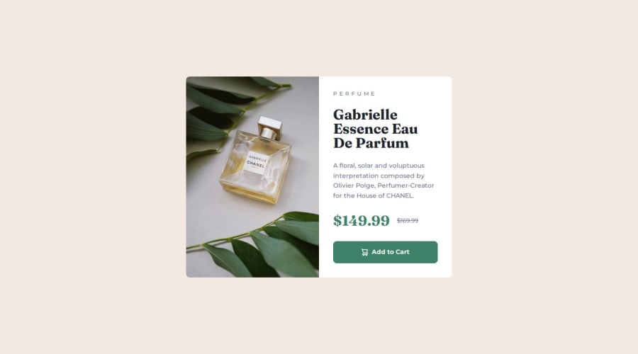
Hello, Kristian, the solution looks great.
Here is what I have to share 👇
- First, I wonder why you need an extra div around the
imgtag because it's pretty self-manageable until you plan to add some overlay, for instance. - For the old price, which has a line-through, you can actually use
deltag, it would fit here perfectly:<del>$169.99</del>. So you won't need to add extra CSS plus it conveys the semantic meaning of the old price value. You did similar perfectly with<strong>$149.99</strong>. - The cart image in the button doesn't need any alt because technically it's just a decoration. Decoration means that it's just there for the visuals but it doesn't bring any actual importance. If, let's say you had no text there and only an icon and the icon triggered the click, then it would be important. In this case, you can keep it as
alt=""but because of this better to addaria-hidden="true"to make sure that screen readers also skip this. - Finally, usually it's better to separate CSS reset into another file but in this scenario, it might not bring a huge difference. Simply, it's always better to separate the concerns.
Hope any of this helps, nice job 😎
Marked as helpful0P@klhaugPosted 5 days ago@catherineisonline Thank you so much! These are really good recommendations. I appreciate it 🍀
0 - First, I wonder why you need an extra div around the
- @saimasial-bitPosted 9 days ago
"Great job on the solution! The layout looks clean and responsive. However, I noticed that you haven't used semantic HTML elements like <article> and <section>. Adding them would improve accessibility and readability. Also, on smaller screens, the text alignment looks slightly off. Adjusting the padding/margins might help. Keep up the great work!"
Marked as helpful0


Please log in to post a comment
Log in with GitHubJoin our Discord community
Join thousands of Frontend Mentor community members taking the challenges, sharing resources, helping each other, and chatting about all things front-end!
Join our Discord