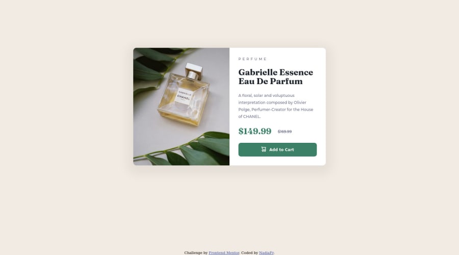
Design comparison
Solution retrospective
One question bothers me. Every project there is a strict instruction for the paragraph font-size. I do the project comparing with the disign pictures, comparing proportions. And it's never the font-size from instructions
Community feedback
- @correlucasPosted about 2 years ago
👾Hello @NadiaFrShLm, Congratulations on completing this challenge!
Your solution its almost done and I’ve some tips to help you to improve it:
To clean your code and use a shortcut to place the images
mobile + desktopwithout need of any media query, use the tag<picture>instead of two<img>wrapped in a div or usingbackground-image. Look that for SEO and search engine reasons it isn't a better practice to import this product image with CSS since this will make harder to the image be found. You can manage both images inside the<picture>tag and use the html to code to set when the images should change setting the devicemax-widthdepending of the device (phone / computer) Here’s a guide about how to usepicture:https://www.w3schools.com/tags/tag_picture.asp✌️ I hope this helps you and happy coding!
Marked as helpful1 - @john-miragePosted about 2 years ago
Hello,
Depending of your strategy to follow the design, you may not taking care of the paragraph font-size.
My strategy is to open figma and add frames with the pictures of the project in it (with their original sizes). After you can measure elements and spacings and write text with the according font to know every sizes used.
Subscribing to the pro version of Frontend mentor is the best choice offcourse because you can have the design files.
Marked as helpful1
Please log in to post a comment
Log in with GitHubJoin our Discord community
Join thousands of Frontend Mentor community members taking the challenges, sharing resources, helping each other, and chatting about all things front-end!
Join our Discord
