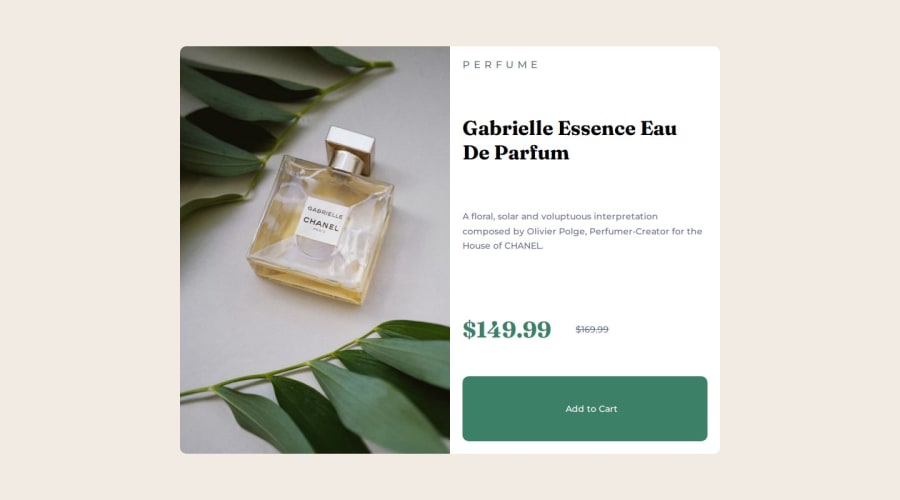
Product Preview Card | Flex | Grid | HTML | CSS
Design comparison
Solution retrospective
Can someone help me with finding the correct styles ? Some seem slightly off from the design.
Community feedback
- @ortalyartsPosted about 1 year ago
Hello @FabianoTerdenge!
Nice work!
I have a few suggestions for you:
-
I would recommend you to be a little bit more specific with the width for the main container (it is <main> in your solution). For example, from the design file I see, that the width of the main container for the desktop should be 600px = 37.5rem. So you can set the main to:
max-width: 37.5rem;Like this you prevent that the whole design gets stretches to fit wide screens. This may cause a little bug though: because the <body> is a flex, it can make the <main> shrink... To avoid this try setting the body tojustify-content: center; -
The image and the div.info won't have equal width, though you specified
width: 50%because of the padding of the .info. The paddings add width to the specified width. To avoid this just always include this fix in your CSS:
*, *::before, *::after { box-sizing: border-box; }- Little advice - try to avoid using px and use em or rem instead. There are easy online convertors for that.
I hope you find this helpful! Cheers :)
1 -
- @kristinakasalovaPosted about 1 year ago
Hi Fabiano,
looks good!
As a fellow newbie who recently finished the same challenge I have only few tips or rather questions for you, since I wonder what is better practice. :)
- h2: I noticed that you wrote it out in capital letters in HTML. It may be worth considering to include
text-transform: uppercaseandletter-spacingjust to be on the safe side, ensure replicability and not to be dependent on the HTML input. - I wonder why do you keep adjusting the
<main>tag for different break points since from the visual aid the split looks either 50/50 or 100% and therefore your picture gets cropped too much. This is just a thought from my side.
0@FabianoTerdengePosted about 1 year ago@kristinakasalova Hi Kristina, Letter-spacing and text-transform: uppercase is implemented now. The main element was used to center the card and set the with of the content for various device widths.
0 - h2: I noticed that you wrote it out in capital letters in HTML. It may be worth considering to include
Please log in to post a comment
Log in with GitHubJoin our Discord community
Join thousands of Frontend Mentor community members taking the challenges, sharing resources, helping each other, and chatting about all things front-end!
Join our Discord
