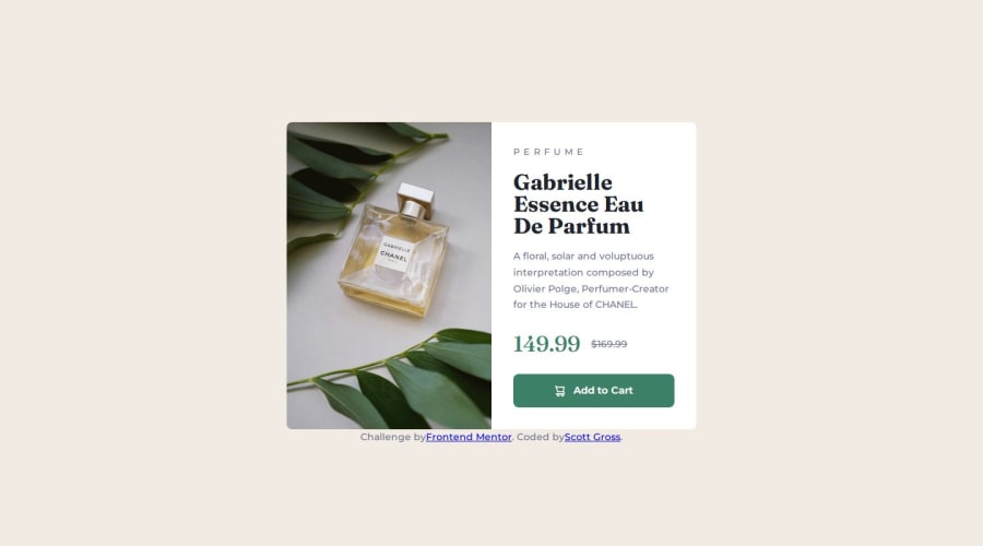
Design comparison
Solution retrospective
I’m most proud of improving my understanding and application of media queries and flexbox. This project gave me hands-on experience with creating responsive layouts, and it was rewarding to see the design adapt smoothly between mobile and desktop views. Additionally, I’m happy with how I managed to implement hover states and accessibility improvements, making the card both functional and user-friendly.
Next time, I would focus more on refining the spacing and alignment of elements to match the design more precisely. I struggled a bit with getting margins and paddings just right, so improving those skills would be a key focus for me. I’d also explore more advanced CSS layout techniques, such as CSS Grid, to handle layout complexity more efficiently and gain a deeper understanding of how to handle responsive designs.
By applying these learnings, I aim to improve both the aesthetic precision and the structural flexibility of future projects.
What challenges did you encounter, and how did you overcome them?One of the main challenges I faced was understanding and applying media queries for the first time. Initially, I struggled to switch between the mobile and desktop images and to adjust the layout for different screen sizes. To overcome this, I researched media queries and experimented with a min-width of 600px to create a responsive layout. Through trial and error, I learned how to structure my HTML and CSS to ensure that the design looked good across various devices.
Another challenge was getting the spacing and alignment of elements correct, especially when using flexbox. I found that certain elements weren’t lining up as expected, so I spent time tweaking the margins and padding. By testing the layout in different browsers and devices using Firefox’s inspect tool, I was able to identify where adjustments were needed and eventually achieve the desired result.
These challenges provided valuable learning experiences in both responsive design and layout control.
What specific areas of your project would you like help with?Spacing and Alignment: I struggled with getting the spacing between elements to match the design, especially when transitioning between mobile and desktop layouts. Any advice on how to better manage spacing using flexbox, margins, or padding would be greatly appreciated.
Media Queries: While I was able to implement a basic media query to switch between images, I’m not sure if I’ve set it up in the most efficient way. I’d love feedback on how to optimize my media queries for better performance and flexibility across more screen sizes.
Accessibility Improvements: I’ve made an effort to improve accessibility by using semantic HTML and visually-hidden content for screen readers. However, I’m new to accessibility best practices, and I would like advice on any additional steps I could take to make my project even more accessible.
Please log in to post a comment
Log in with GitHubCommunity feedback
- P@Stroudy
Awesome job tackling this challenge! You’re doing amazing, and I wanted to share a couple of suggestions that might help refine your approach…
-
For future project, You could downloading and host your own fonts using
@font-faceimproves website performance by reducing external requests, provides more control over font usage, ensures consistency across browsers, enhances offline availability, and avoids potential issues if third-party font services become unavailable. Place to get .woff2 fonts -
This does not matter that much at this stage but something to be mindful of for SEO(Search Engine Optimisation),
<meta>description tag missing that helps search engine determine what the page is about, Something like this<meta name="description" content="description goes here" /> -
Setting the
widthandheightfor an<img>helps the page load faster and prevents content from jumping around as the image loads. This is good for performance and improves user experience. However, if your image needs to keep a consistent shape (aspect ratio) across different screen sizes, it's better to use the CSSaspect-ratioproperty instead. -
Using
remoremunits in@mediaqueries is better thanpxbecause they are relative units that adapt to user settings, like their preferred font size. This makes your design more responsive and accessible, ensuring it looks good on different devices and respects user preferences.
You’re doing fantastic! I hope these tips help you as you continue your coding journey. Stay curious and keep experimenting—every challenge is an opportunity to learn. Have fun, and keep coding with confidence! 🌟
-
- @Ayako-Yokoe
This looks great! It seems you accidentally omitted the "$" sign, so you can add it back. Also, consider applying font-weight: 700 for the price.
Join our Discord community
Join thousands of Frontend Mentor community members taking the challenges, sharing resources, helping each other, and chatting about all things front-end!
Join our Discord
