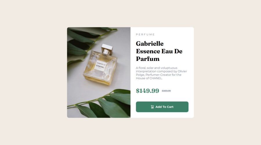


Design comparison

Solution retrospective
I’ve learned to create cards much faster, align items, and so on, but I’m still struggling with image manipulation, as well as learning to use the tag.
What challenges did you encounter, and how did you overcome them?In images, I didn’t know the `` tag existed to switch images when the screen size changes. But I had problems making the site responsive for mobile screens, so that part is quite wrong, including the size of the card and the image as well.
What specific areas of your project would you like help with?I’d like to know the best tutorials for CSS. I’m looking to review the content from scratch, especially about image manipulation and how to make a website more responsive.
Community feedback
- P@lynx232Posted 4 months ago
"Does the solution include semantic HTML?"
- Yes it does!
"Is it accessible, and what improvements could be made?"
- It is.
"Does the layout look good on a range of screen sizes?"
- No. As you are aware, anything bellow 768px doesn't look quite right.
"Is the code well-structured, readable, and reusable?
- It is. If I could make a suggestion anyway, even though this is more of a personal preference, use commentaries to categorize portions of your code.
"Does the solution differ considerably from the design?"
- No. Good job!
Now, there's not much I can tell you to help you on your journey, since I'm a beginner myself, still here are a few things to consider:
- Good use of the reset, but I suggest you use a more modern one such as A Modern CSS Reset;
- Good use of css variables to define the colors you used;
- In order to fix the mobile breakpoint I suggest you use justify-flex-direction: column for mobile and flex-direction: row for desktop inside .container. Also I suggest you remove all padding for this class in order for the image to fit completely.
- If you don't want all the corners of a box(in your case image) to be rounded, or otherwise to be(see your product image for mobile breakpoint - left corners) you can use border-bottom/upper-left/right-radius to modify only the corners you desire;
- For mobile I suggest you use the margins function to modify the .container such that it will resemble the reference photo more;
- This one is very minor but it's good to know anyways - you could have also made "Perfume" uppercase by using the text-transform: uppercase" function in css.
Overall I wish I could be of more use but I am just a beginner myself. Still, I think you did a very good job overall and while I think we both have a lot more to learn, I have to say that your code is the best I've seen so far here.
Best of luck on your journey!
0

Please log in to post a comment
Log in with GitHub
Join our Discord community
Join thousands of Frontend Mentor community members taking the challenges, sharing resources, helping each other, and chatting about all things front-end!
Join our Discord