Design comparison
Solution retrospective
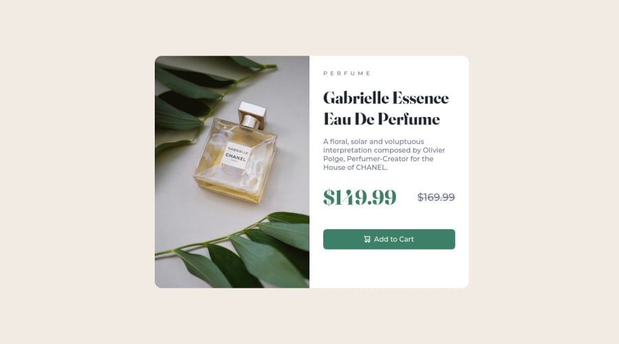
This is my third challenge; I hope I didn't mess up too many aspects of it. The challenge made me research and figure out stuff about media queries, swapping images, and, most important, that extremely intuitive 'grid-template-areas' property. It also put what I already know about flex to great use. Those things were the most challenging and productive.
Although it likely sounds presumptuous, I wouldn't say I'm 'unsure' about a particular area of the code. On the contrary, I saw that the <div> in my container gets taller than the image at a certain weight. I also encountered the same <div> 'gathers' all its elements/headings in its top portion when the Chrome is full size with no Inspect Tool open. To prevent that, I added another media query. So I'll be glad if someone can give me feedback on the media-query transitions.
P.S. I am a content creator and writer creating content about spiritual and personal development and nutrition; I wonder whether I should write about/document my coding progress on the same or a separate Medium page to include my content on tech, i.e., reviews, unboxing, etc.? I'll be happy if you share your opinion on that.
Sincere, Pete
Community feedback
- @yogeshdatirPosted over 2 years ago
Hey Pete, great efforts! You have done an excellent job.
One suggestion that I would like to share with you is that font family and font sizes become crucial when a user reads an informative text. You can improve this solution greatly by changing the font family and sizes.
As we have a pretty short time window to hook up the user to learn more from our content, we can help users to learn things with ease.
Keep up the good work!
Marked as helpful0@PeteonthebeatPosted over 2 years ago@yogeshdatir Hey @yogeshdatir, Thank you for this thoughtful comment. I agree entirely, and I actually included different font-size adjustments in the media queries, so the element looks maximally presentable on all screens, including the browser's full size, especially 375 and 1440px, which the challenge emphasized.
Your suggestion about following a somewhat similar approach with the font family, thus changing the font depending on the resolution, also makes sense. On the contrary, the challenge required using a couple of specified fonts and replicating the component as best as possible. So I stuck to the instructions.
Thanks for the encouragement!
Sincere, POTB
0 - @correlucasPosted over 2 years ago
πΎHello Pete, congratulations for your solution!
There's not so much to say about your challenge you've done pretty much anything, the design elements are perfect, the container is super responsive, the media query are working fine. This is amazing! Congrats, is a really well done challenge.
There are two things you can consider to change in order to improve the semantics, you've used
<div>
thats a block element without a semantical meaning, in this case you case use<main>
or<section>
to wrap the card content and to keep it even easier use the<picture>
to wrap both desktop and mobile images.I think is a great ideia that you document you creative process to build this challenge, you should have many soft skills since you've other background that's not coding. The article in Medium seems an amazing ideia and for sure will help many person.
Pete, keep it up and happy coding!
Marked as helpful0@PeteonthebeatPosted over 2 years agoHello @correlucas, Thank you so much for the detailed feedback and encouragement. I'll definitely consider the valuable tips on semantics. Truth be told, I thought about using a <main> or <section> tag for the ''container,'' initially, but I went with the ''good old'' <div> for no particular reason. Being a total noob, I view those (mainly) as ''vessels'' to carry other grid/flex containers.
A good example would be a one-page website with a nav, etc. In such cases, I'd use <section> tags to define the page's different portions and link them to the <navbar> items, using their IDs. Then based on the situation, I'll have one or more <div> tags within each section to hold and display its actual content. Nevertheless, thinking that this is the only way to use such elements likely is narrow-minded and results from my lack of experience. So I really appreciate the advice! :)
As long as for the <picture> tag... Honestly, I never heard of that. Since I started this journey, I've been using <img>, but that's probably old. Perhaps, I tend to stick to obsolete tags, like I did in the last challenge, using a <strike> tag. Thanks to the Frontend Mentor, I know that's super old, and I should use the <s> tag instead. So I did in this challenge.
And yes, I dare to believe I can bring some decent or even better content quality. I have done this for years on different topics. So why not do it for coding as well? I even started a tech channel on youtube already. Thanks for the encouragement and for taking the time to look at my work and write this comment! It really means a lot!
Stay Safe!
Sincere, POTB
1@correlucasPosted over 2 years ago@Peteonthebeat that's amazing and the best thing was that these things I wrote you, were tips people gave me months ago here in FEM. If you decide to share a your tips about these challenges in Medium or somewhere, please share with us. Have a nice day. π
Marked as helpful0
Please log in to post a comment
Log in with GitHubJoin our Discord community
Join thousands of Frontend Mentor community members taking the challenges, sharing resources, helping each other, and chatting about all things front-end!
Join our Discord