Submitted over 1 year ago
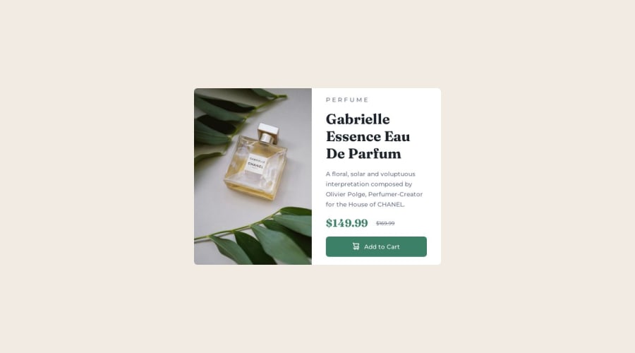
Product Preview Card Components
#sass/scss
@ebarreto-mendoza
Design comparison
SolutionDesign
Solution retrospective
Hello Frontend Mentor Community! This here is my second Frontend Mentor project, using only html and css (sass preprocessor). In this project, I was focusing more on using Semantic HTML above everything else. Also, this was my first time attempting to use media query to make a website that is responsive to mobile view. Any feedback on best practices for Semantic HTML and mobile first design would be greatly appreciated. Thank y'all !
Community feedback
Please log in to post a comment
Log in with GitHubJoin our Discord community
Join thousands of Frontend Mentor community members taking the challenges, sharing resources, helping each other, and chatting about all things front-end!
Join our Discord
